[Flyouts] Enhancements for Flyout Menu actions - #9856
Conversation


- Update [`packages/eui/src/components/flyout/flyout_menu.tsx`](packages/eui/src/components/flyout/flyout_menu.tsx) with a shared `EuiFlyoutMenuAction` type supporting EUI-standard `toolTipContent` and `toolTipProps`, plus `leadingActions` and `trailingActions` props.
- Keep `customActions` as a deprecated compatibility alias for `trailingActions`; prefer `trailingActions` if both are supplied. Export the new type from [`packages/eui/src/components/flyout/index.ts`](packages/eui/src/components/flyout/index.ts).
- Refactor action rendering so both slots preserve required accessible labels/click behavior and wrap buttons in `EuiToolTip` only when tooltip content is supplied.
- Build an inline-start cluster that renders pagination or back/history first, then `leadingActions`, with logical spacing in [`packages/eui/src/components/flyout/flyout_menu.styles.ts`](packages/eui/src/components/flyout/flyout_menu.styles.ts). This matches the pagination PNG and also allows leading actions without pagination.
- Change the history trigger to `clockCounter` and add a translatable “Recently visited” tooltip, while retaining its accessible history label and popover behavior.
- Extend [`packages/eui/src/components/flyout/use_flyout_menu.ts`](packages/eui/src/components/flyout/use_flyout_menu.ts) so either new action slot counts as meaningful content in automatic display mode.

- Use “control-group divider” in prose and a local `euiFlyoutMenu__divider` style in code. EUI consistently calls these compact vertical lines “dividers”; “rule” is reserved for the horizontal `EuiHorizontalRule`, and there is no reusable `EuiVerticalRule` component or shared vertical-divider mixin.
- Model the styling on the private `dividerStyles` helper in [`packages/eui/src/components/form/form_control_layout/form_control_layout.styles.ts`](packages/eui/src/components/form/form_control_layout/form_control_layout.styles.ts): use a centered, shortened `::before` pseudo-element rather than a full-height border on the action container. Use logical properties, `block-size: ${euiTheme.size.l}`, `pointer-events: none`, and `border-inline-start: ${euiTheme.border.width.thin} solid ${euiTheme.border.color}`.
- Treat the form-control helper as a pattern, not a direct dependency. The explicit short divider in [`packages/eui/src/components/markdown_editor/markdown_editor_toolbar.styles.ts`](packages/eui/src/components/markdown_editor/markdown_editor_toolbar.styles.ts) provides the toolbar sizing/spacing precedent, while [`packages/eui/src/components/button/split_button/split_button.styles.ts`](packages/eui/src/components/button/split_button/split_button.styles.ts) confirms that a border should be used instead of a background so the divider remains visible in Windows high-contrast mode.
- Add dividers only when both adjacent groups exist:
  - Between built-in leading controls (pagination or back/history) and `leadingActions`.
  - Between effective trailing actions (`trailingActions` or deprecated `customActions`) and the built-in close control, only when the close control is visible.
- Attach the pseudo-element to a conditional boundary style or wrapper rather than adding separator semantics to the DOM. For the trailing boundary, account for the absolutely positioned close button by applying the divider modifier to the existing close spacer/action boundary and preserving enough inline spacing for the close hit area.
- Keep all placement RTL-safe with `inset-inline-*`, `margin-inline-*`, and `border-inline-*`; do not use physical left/right properties. If implementation constraints require a real divider element instead of a pseudo-element, follow the split-button precedent and mark it `aria-hidden="true"` rather than giving a decorative line `role="separator"`.
 tsullivan
changed the title
tsullivan
changed the title
tsullivan
changed the title
tsullivan
changed the title

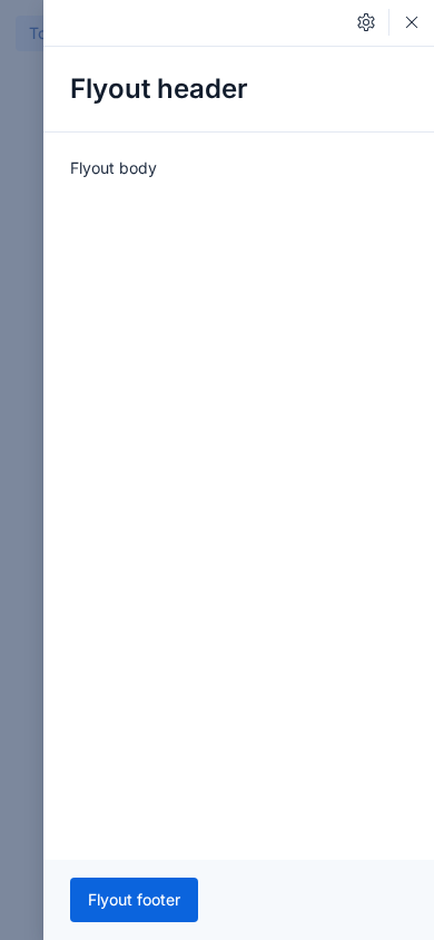
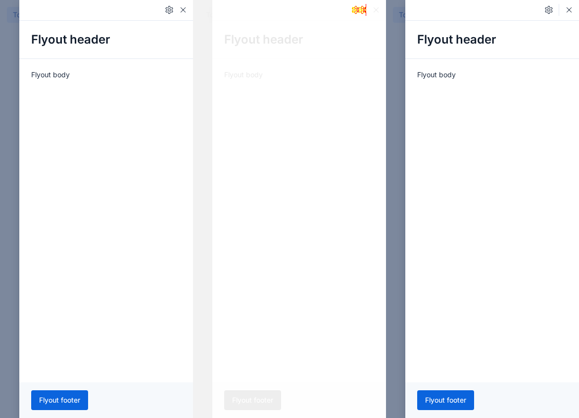
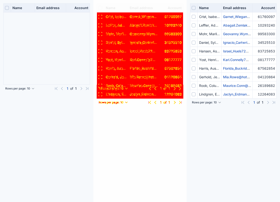
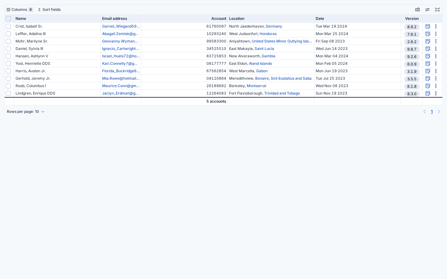
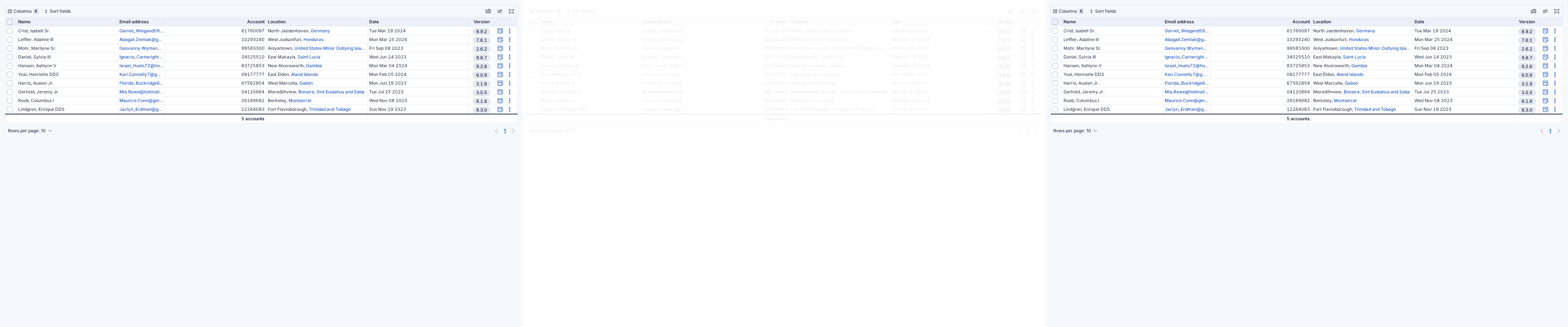
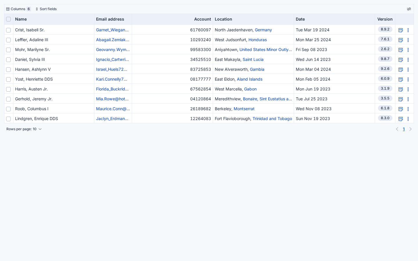
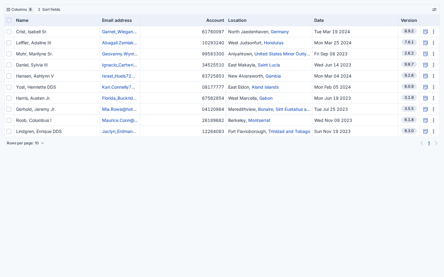
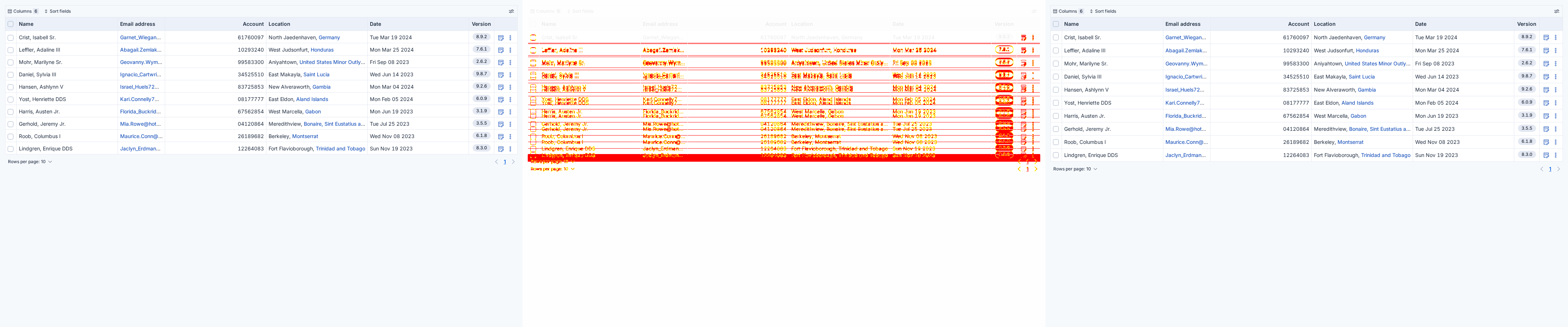
8 visual difference(s) found - expand to review, then click Approve visual changes to update baselineseuiflyout (8 differences)
|
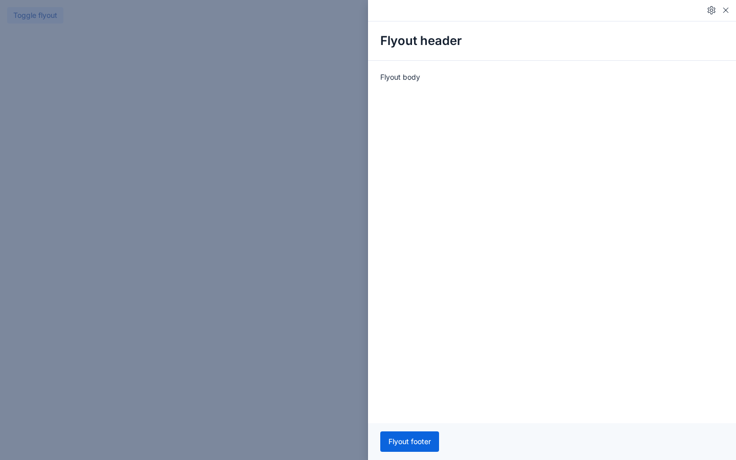
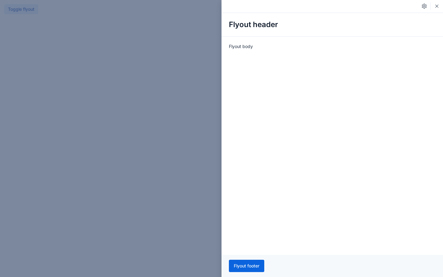
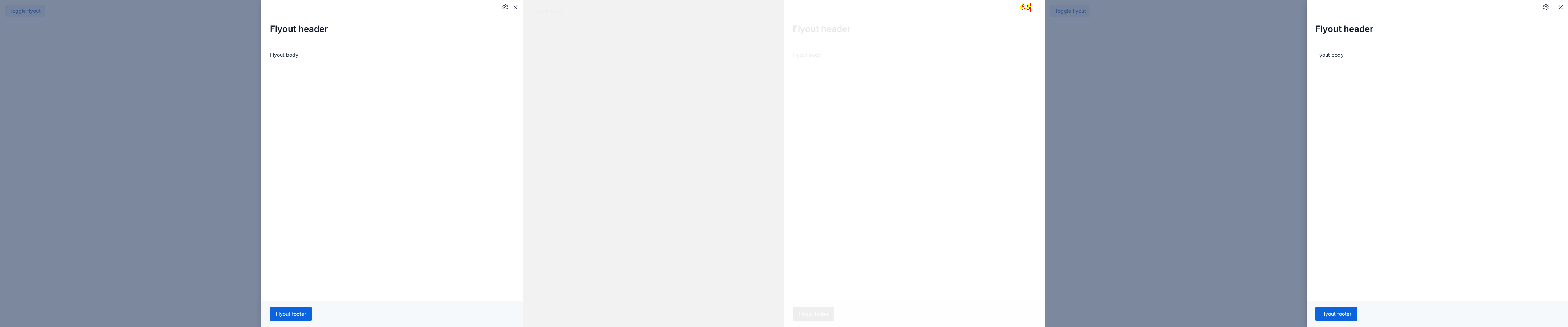
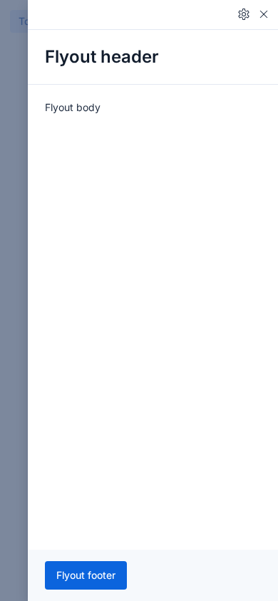
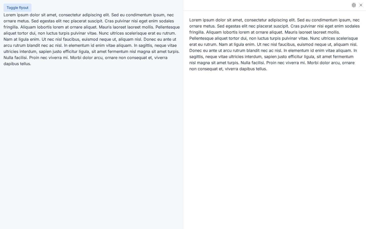
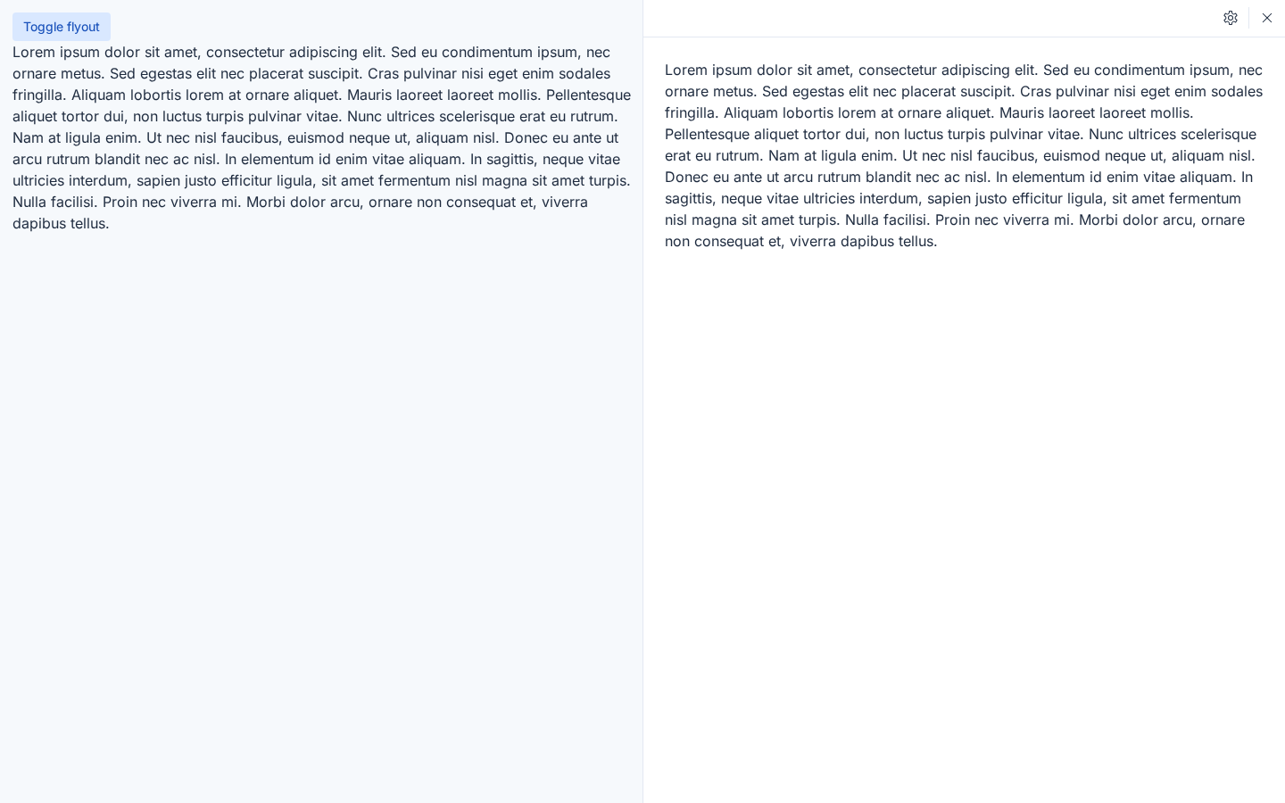
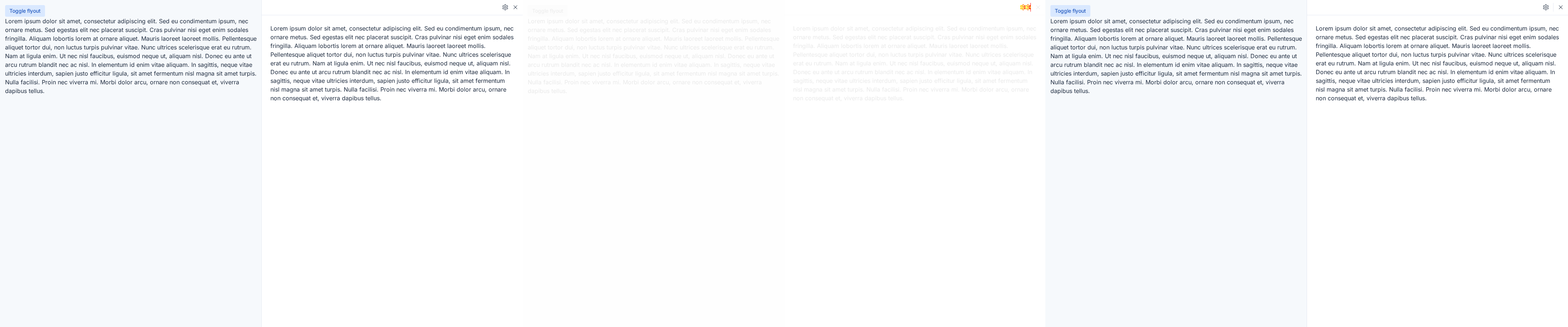
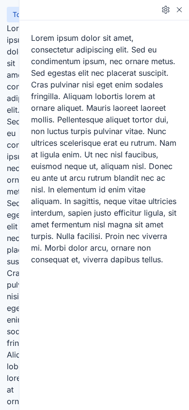
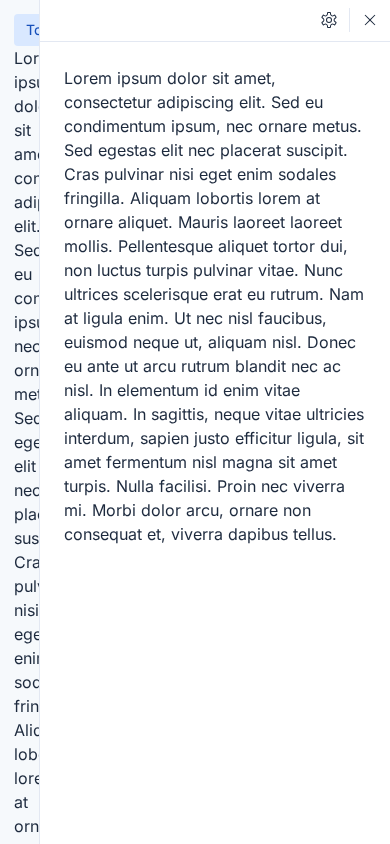
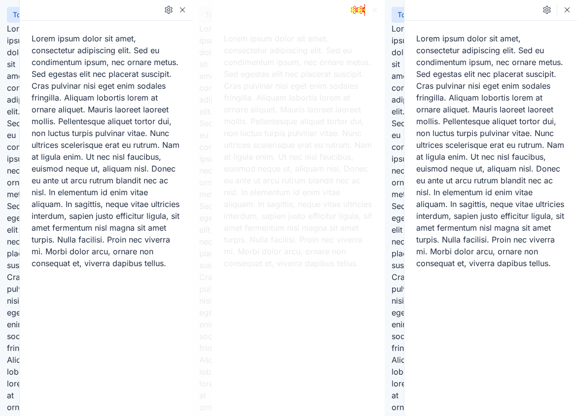
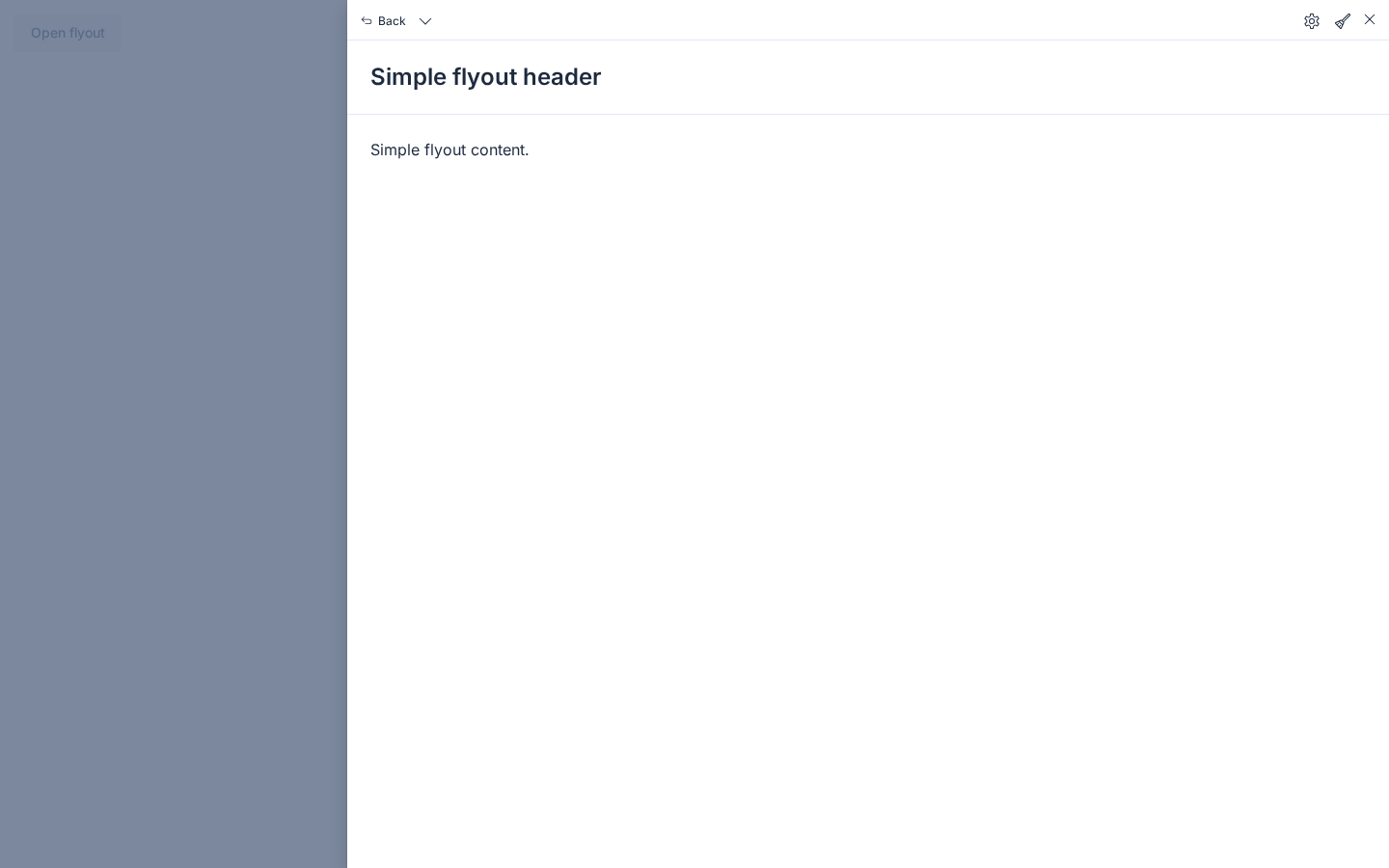
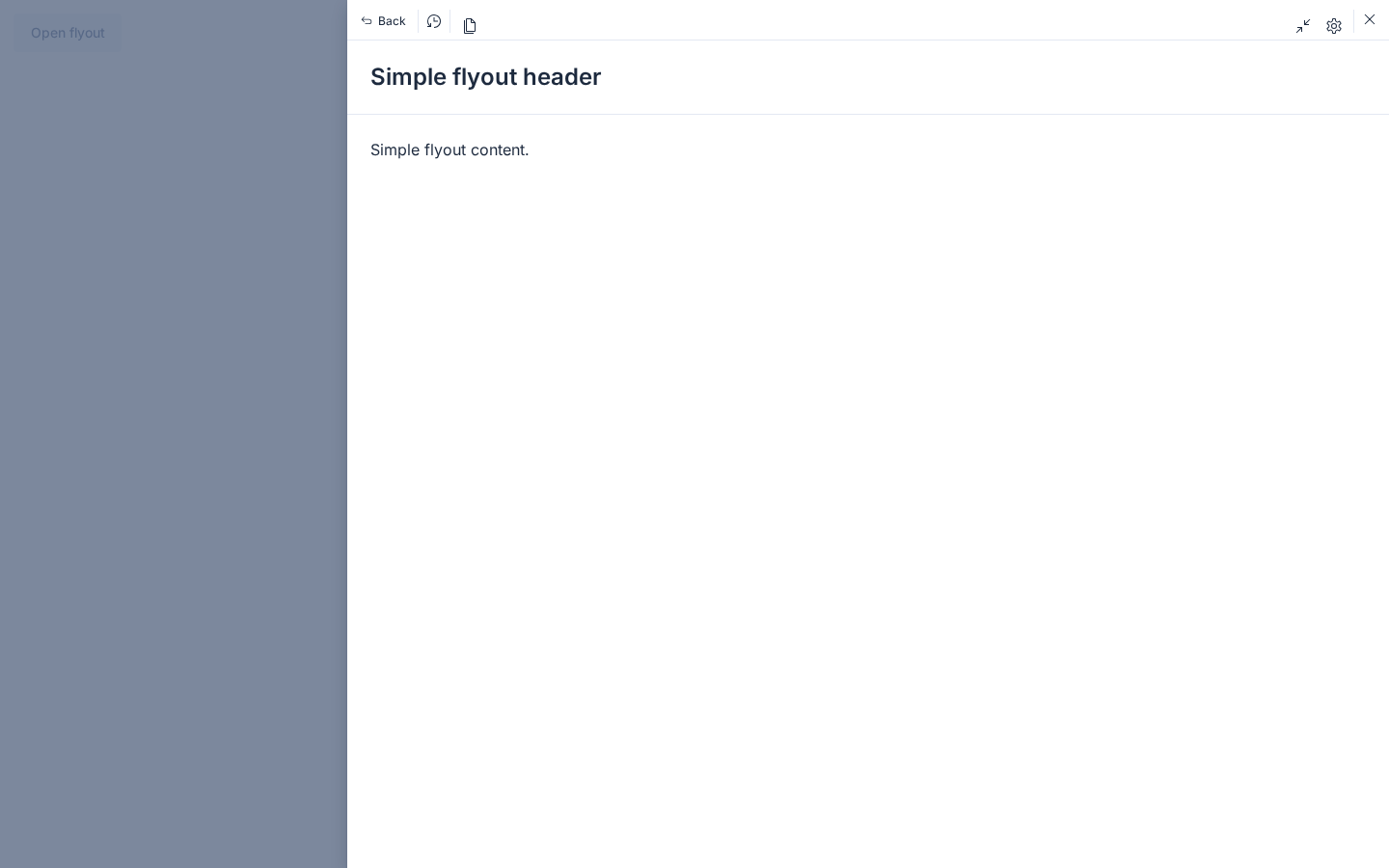
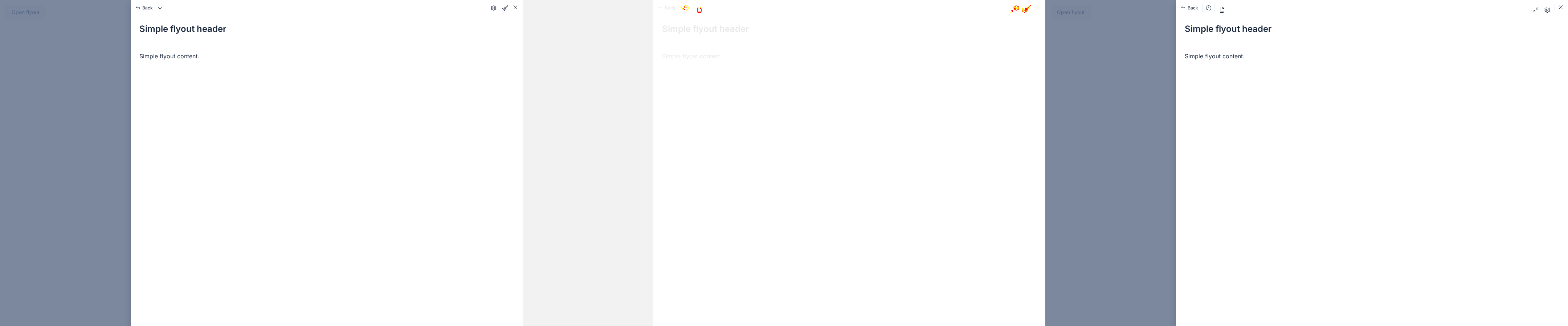
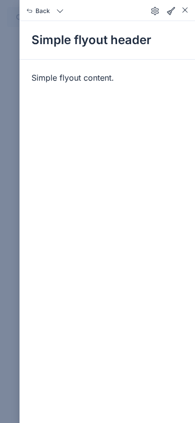
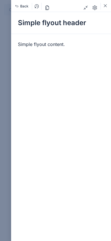
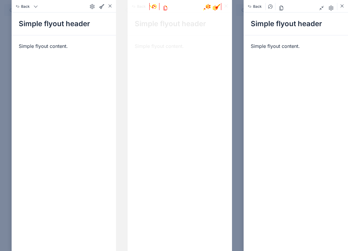
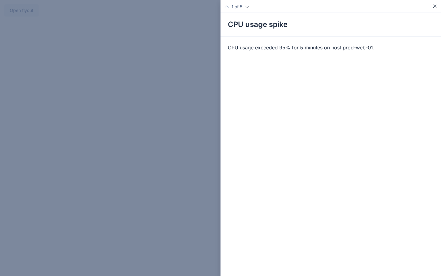
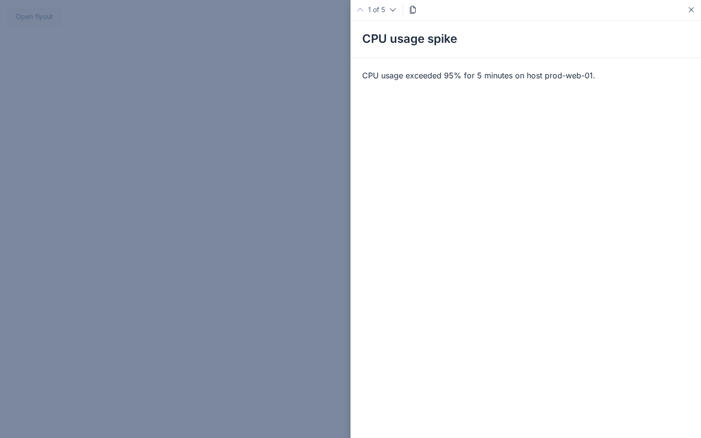
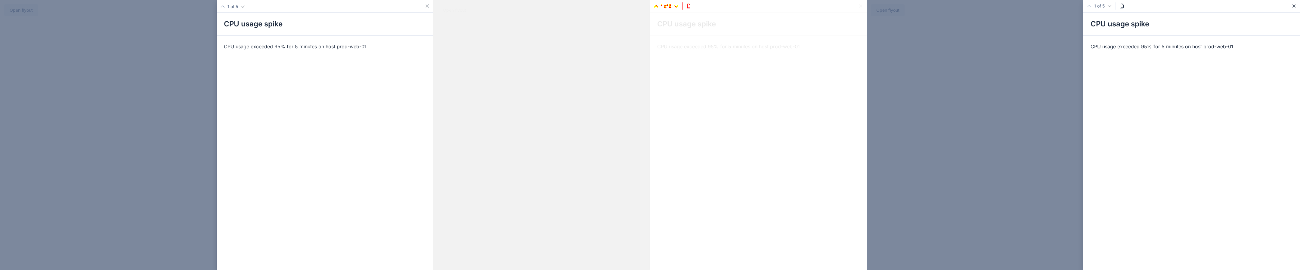
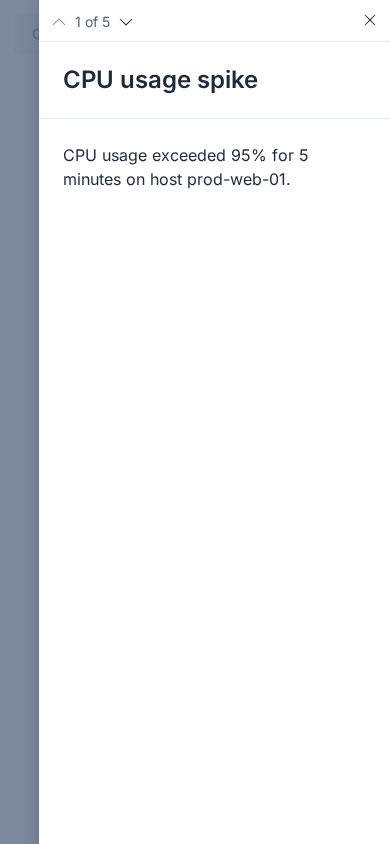
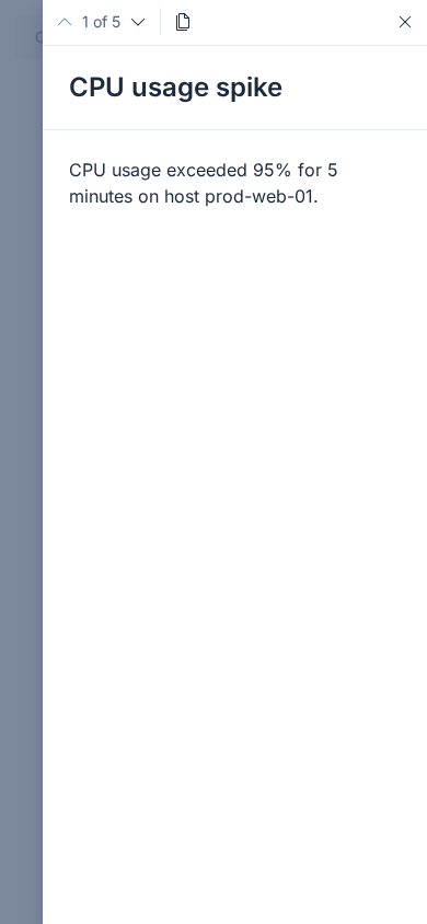
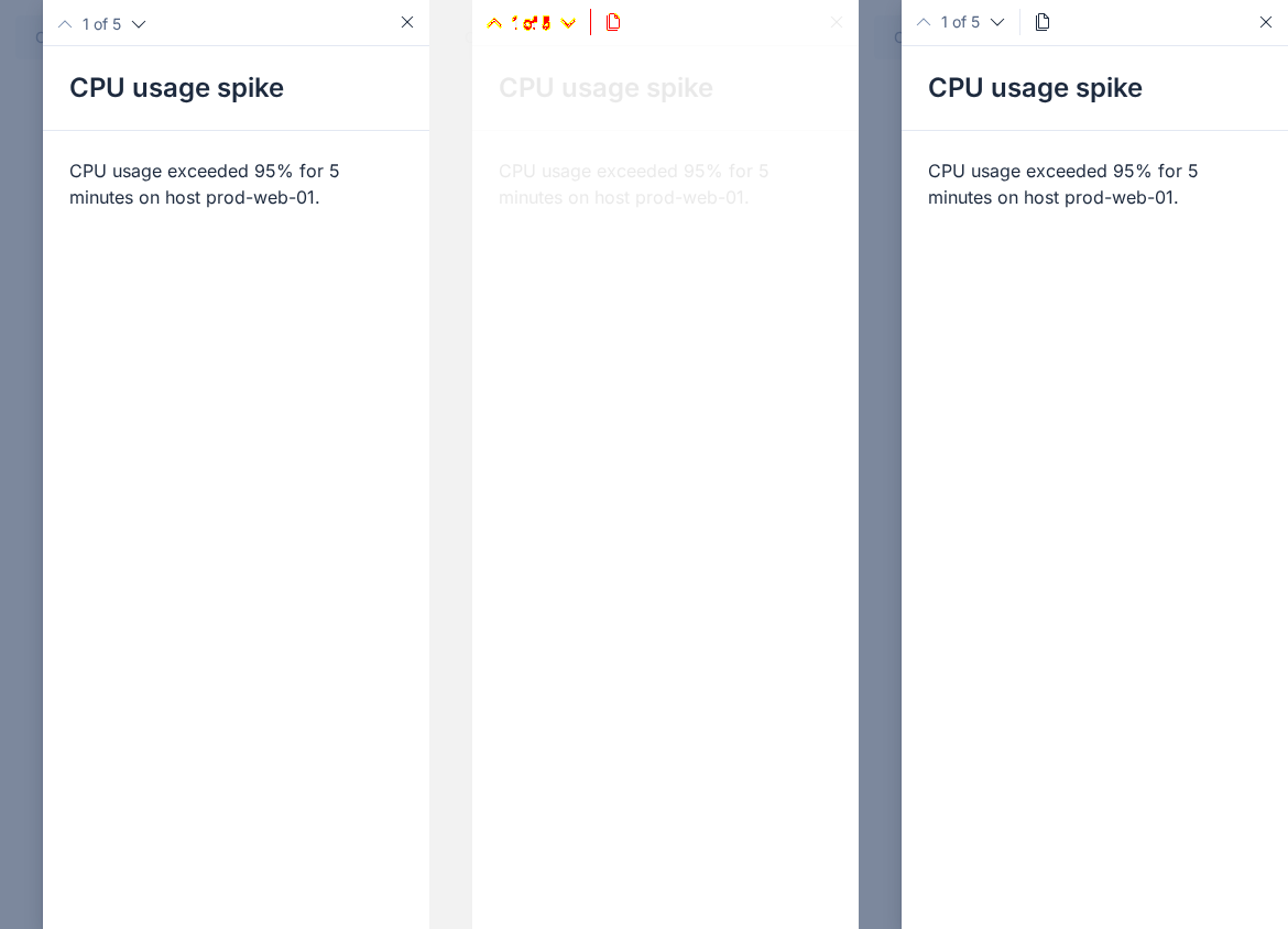


6 visual difference(s) found - expand to review, then click Approve visual changes to update baselineseuiflyout (6 differences)
|
6 visual difference(s) found - expand to review, then click Approve visual changes to update baselineseuiflyout (6 differences)
|
There was a problem hiding this comment.
Pull request overview
Enhances the EuiFlyoutMenu control bar API and UX, adding first-class leading/trailing action slots with tooltip support, improved pagination controls (including optional jump-to-first/last), and refined history behavior/dividers to better match managed flyout navigation patterns.
Changes:
- Added
leadingActions/trailingActions(with newEuiFlyoutMenuActiontype) and deprecatedcustomActionsas a compatibility alias. - Updated menu rendering logic and managed flyout integration to only show the history popover when there are at least 2 history items, and to keep pagination visible for
total >= 1. - Introduced control-group dividers, new pagination icon overrides/jump controls, and updated docs/stories/tests/changelog accordingly.
Reviewed changes
Copilot reviewed 19 out of 21 changed files in this pull request and generated 4 comments.
Show a summary per file
| File | Description |
|---|---|
| packages/website/docs/components/containers/flyout/_flyout_menu.mdx | Updates docs example to use trailingActions, documents tooltips/dividers/deprecation and history-popover threshold. |
| packages/website/docs/components/containers/flyout/_flyout_menu_pagination.mdx | Documents pagination behavior and shows leadingActions grouped with pagination. |
| packages/eui/src/components/flyout/use_flyout_menu.ts | Updates “auto” menu-content detection for new action slots, pagination totals, and history threshold. |
| packages/eui/src/components/flyout/use_flyout_menu.test.ts | Adds coverage for new menu-content detection rules (history threshold, actions, pagination totals). |
| packages/eui/src/components/flyout/manager/flyout_manager.stories.tsx | Updates Storybook controls/examples from customActions to trailingActions. |
| packages/eui/src/components/flyout/manager/flyout_managed.tsx | Aligns pagination visibility behavior to total >= 1. |
| packages/eui/src/components/flyout/manager/flyout_managed.test.tsx | Refactors tests to assert forwarded flyoutMenuProps and adds coverage for new manager-derived menu behavior. |
| packages/eui/src/components/flyout/manager/mocks/index.ts | Tightens mock typing for historyItems. |
| packages/eui/src/components/flyout/index.ts | Exports the new EuiFlyoutMenuAction type. |
| packages/eui/src/components/flyout/flyout.test.tsx | Updates tests to trailingActions and adds managed-history popover threshold coverage. |
| packages/eui/src/components/flyout/flyout.stories.tsx | Updates flyout story controls/examples to trailingActions and demonstrates tooltips. |
| packages/eui/src/components/flyout/flyout_menu.tsx | Implements new actions API, tooltips, dividers, pagination enhancements, and history icon/threshold updates. |
| packages/eui/src/components/flyout/flyout_menu.test.tsx | Adds extensive coverage for new actions/tooltips/dividers/pagination/history behavior. |
| packages/eui/src/components/flyout/flyout_menu.styles.ts | Adds styling for dividers and high-contrast behavior; adjusts action alignment. |
| packages/eui/src/components/flyout/flyout_menu.stories.tsx | Expands menu stories into a configurable playground plus prop-based pagination variants. |
| packages/eui/src/components/flyout/const.ts | Adds MIN_HISTORY_ITEMS constant and updates menu display-mode documentation comment. |
| packages/eui/src/components/context_menu/context_menu_item.test.tsx | Stabilizes tooltip-related tests by resetting the tooltip manager and expands assertions. |
| packages/eui/src/components/context_menu/snapshots/context_menu_item.test.tsx.snap | Removes the old tooltip snapshot that no longer matches refactored tests. |
| packages/eui/changelogs/upcoming/9856.md | Adds changelog entry for new flyout menu actions/pagination/history/divider changes and deprecations. |
Suppressed comments (1)
packages/eui/src/components/flyout/flyout_menu.tsx:95
- The JSDoc default for
nextIconTypeis incomplete: whenonFirstoronLastis provided, the implementation switches the default Next icon tochevronSingleRight(unless overridden).
  /**
   * Icon type for the Next button.
   * @default chevronSingleDown
   */
  nextIconType?: IconType;
💡 Add Copilot custom instructions for smarter, more guided reviews. Learn how to get started.
| // `trailingActions` takes precedence over the deprecated `customActions` alias | ||
| const effectiveTrailingActions = trailingActions?.length | ||
| ? trailingActions | ||
| : customActions ?? []; |
| /** | ||
| * Icon type for the Previous button. | ||
| * @default chevronSingleUp | ||
| */ | ||
| previousIconType?: IconType; |
| (flyoutMenuProps.trailingActions?.length ?? 0) > 0 || | ||
| (flyoutMenuProps.customActions?.length ?? 0) > 0 || |
|
|
||
| Use `leadingActions` to render actions grouped alongside the pagination controls. A divider is automatically shown between the pagination controls and `leadingActions`. | ||
|
|
||
| The Prev/Next buttons default to up/down chevrons. Pass `pagination.previousIconType` and `pagination.nextIconType` to override them, e.g. with left/right chevrons when paging through horizontally-oriented content. |


|
|
||
| **Deprecations** | ||
|
|
||
| - Deprecated `customActions` and `EuiFlyoutMenuCustomAction` in `EuiFlyoutMenu`; use `trailingActions` and `EuiFlyoutMenuAction` instead |
There was a problem hiding this comment.
@tsullivan we should add this to our deprecation schedule to be removed, maybe in 3 months?
1 visual difference(s) found - expand to review, then click Approve visual changes to update baselineseuidatagrid (1 difference)
|
💚 Build Succeeded
History
|
2 visual difference(s) found - expand to review, then click Approve visual changes to update baselineseuidatagrid (2 differences)
|
💔 Build Failed
Failed CI StepsHistory
|
 weronikaolejniczak
left a comment
weronikaolejniczak
left a comment
weronikaolejniczak
left a comment
There was a problem hiding this comment.
Code-wise (action required): 🟡 I agree with Copilot's comments (though the non-empty trailingActions being won by customActions is very edge-casey) and I noticed a couple more things. They're mostly nits and non-blocking.
Result-wise (decision required): 🟡 Tested in Storybook, works as expected 👌🏻 Only one visual doubt, actions don't seem to have a gap:

It looks unbalanced when compared to the line-separated actions:


but what's most important is that these are XS icon buttons that don't provide a lot of clickable space but now they're right next to each other which could easily lead to misclicks and users being frustrated.
Test-wise (action required): 🟡 I updated the VRT references (that being said, there are some flakes that were added 🥲 sorry about that, you might have to drop that unrelated VRT image and I'll dig in why it keeps popping up).
Kibana-wise: 🟢 I don't think any changes need to be prepared in Kibana, the existing test files reference the now deprecated API but in a non-breaking way.
| export const createFlyoutManagerMock = () => ({ | ||
| state: createMockState(), | ||
| historyItems: [], | ||
| historyItems: [] as FlyoutManagerApi['historyItems'], |
There was a problem hiding this comment.
non-blocking suggestion:
Instead of asserting the type: as FlyoutManagerApi['historyItems'], could we define a return type for the function?
| control: { type: 'radio' as const }, | ||
| options: ['default', 'horizontal', 'jump'] as PaginationVariant[], | ||
| description: | ||
| 'Story-only control for the shape of the pagination controls. "horizontal" sets `pagination.previousIconType`/`nextIconType` to left/right chevrons, mimicking apps like Discover that page through horizontally-oriented content. "jump" adds `pagination.onFirst`/`onLast` for jumping to the beginning and end of the list, which switches the Prev/Next chevrons to left/right on its own.', |
There was a problem hiding this comment.
nit: We all know EUI is mostly used in Kibana but it still is a separate library so mentioning Kibana specific functionalities like "Discover" may be confusing. Could we do without?
| 'Story-only control for the shape of the pagination controls. "horizontal" sets `pagination.previousIconType`/`nextIconType` to left/right chevrons, mimicking apps like Discover that page through horizontally-oriented content. "jump" adds `pagination.onFirst`/`onLast` for jumping to the beginning and end of the list, which switches the Prev/Next chevrons to left/right on its own.', | |
| 'Story-only control for the shape of the pagination controls. "horizontal" sets `pagination.previousIconType`/`nextIconType` to left/right chevrons. "jump" adds `pagination.onFirst`/`onLast` for jumping to the beginning and end of the list, which switches the Prev/Next chevrons to left/right on its own.', |
| {effectiveTrailingActions.map((action, actionIndex) => ( | ||
| <EuiFlexItem | ||
| key={`trailing-action-${actionIndex}`} | ||
| grow={false} | ||
| css={styles.euiFlyoutMenu__actions} | ||
| > | ||
| <MenuActionButton action={action} /> | ||
| </EuiFlexItem> | ||
| ))} | ||
|
|
||
| {/* spacer to give trailing actions room around the close button */} | ||
| {!hideCloseButton && ( | ||
| <EuiFlexItem grow={false} css={styles.euiFlyoutMenu__spacer} /> | ||
| <EuiFlexItem | ||
| grow={false} | ||
| css={[ | ||
| styles.euiFlyoutMenu__spacer, | ||
| showTrailingCloseDivider && styles.euiFlyoutMenu__divider, | ||
| ]} | ||
| className={ | ||
| showTrailingCloseDivider ? 'euiFlyoutMenu__divider' : undefined | ||
| } | ||
| aria-hidden={showTrailingCloseDivider ? 'true' : undefined} | ||
| /> |
There was a problem hiding this comment.
non-blocking suggestion:
A very nit-picky thing. Instead of adding comments, I would create module-level React components.
The file is bloated so I would also consider moving components to separate modules. We could create a flyout_menu/ subfolder with all related components.
| /** | ||
| * Optional props to pass to the underlying **[EuiToolTip](/#/display/tooltip)**. | ||
| * Only used when `toolTipContent` is also provided. | ||
| */ |
There was a problem hiding this comment.
nit:
This hash router is incorrect. I see why an agent would add it because there's plenty of these deprecated links all around the code from the old documentation website.
| /** | |
| * Optional props to pass to the underlying **[EuiToolTip](/#/display/tooltip)**. | |
| * Only used when `toolTipContent` is also provided. | |
| */ | |
| /** | |
| * Optional props to pass to the underlying {@link EuiToolTip}. | |
| * Only used when `toolTipContent` is also provided. | |
| */ |
or
| /** | |
| * Optional props to pass to the underlying **[EuiToolTip](/#/display/tooltip)**. | |
| * Only used when `toolTipContent` is also provided. | |
| */ | |
| /** | |
| * Optional props to pass to the underlying **[EuiToolTip](https://eui.elastic.co/docs/components/display/tooltip/)**. | |
| * Only used when `toolTipContent` is also provided. | |
| */ |
(It'd have to be tested which one works better)
There was a problem hiding this comment.
nit: I find the comments in this file very verbose. It's great we have them for more visual context but some things are self-explanatory.
| }; | ||
|
|
||
| export const PaginationExample: StoryObj = { | ||
| export const PaginationExample: StoryObj<Args> = { |
There was a problem hiding this comment.
non-blocking suggestion:
Let's disable hideTitle and hideCloseButton in story argTypes.
The story shows hideTitle and hideCloseButton story controls that don't do anything because of that StoryObj<Args> which applies all meta-level argTypes including props that PaginationFlyout doesn't accept.


Closes #9855
Closes #9304
Summary
What: Follow-up enhancements to the
EuiFlyoutMenucontrol bar:leadingActionsandtrailingActionsslots, accepting the newEuiFlyoutMenuActiontype withtoolTipContent/toolTipPropssupport.leadingActions,trailingActionsvs. the close button).onFirst/onLast.clockCounter.customActions/EuiFlyoutMenuCustomActionare deprecated in favor oftrailingActions/EuiFlyoutMenuAction.How / notes for reviewers:
customActionsis kept as a compatibility alias so this can ship in a patch. When both are supplied,trailingActionswins.onFirstoronLastis present, the row reads as a horizontal track, so Prev/Next default tochevronSingleLeft/chevronSingleRight.API Changes
EuiFlyoutMenuleadingActionsEuiFlyoutMenuAction[]rendered at the inline-start of the menu bar, after built-in controls, separated by an automatic dividerEuiFlyoutMenutrailingActionsEuiFlyoutMenuAction[]rendered at the inline-end of the menu bar, before the close buttonEuiFlyoutMenucustomActionstrailingActionsinstead; still honored as an alias, buttrailingActionstakes precedence when both are suppliedEuiFlyoutMenuhistoryItemsScreenshots
Demos
Flyout.Menu.Pagination.Demo.mp4
Flyout.Menu.History.Navigation.mp4
Flyout.Menu.Dark.Mode.High.Contrast.mp4
Impact Assessment
Note: Most PRs should be tested in Kibana to help gauge their Impact before merging.
[ ] 🔴 Breaking changes — What will break? How many usages in Kibana/Cloud UI are impacted?Impact level: 🟢 None / 🟢 Low / 🟡 Moderate / 🔴 High
Release Readiness
[ ] Migration guide: {steps or link, for breaking/visual changes or deprecations}QA instructions for reviewer
Checklist before marking Ready for Review
breaking changelabel (if applicable)Reviewer checklist