An interactive canvas library for Flutter inspired by Fabric.js.
Place, draw, select, move, scale, rotate, and style canvas objects — with a single widget that works on mobile, tablet, desktop, and web.
- Quick start
- FabricBoard — the all-in-one widget
- Advanced usage — FabricCanvas + FabricController
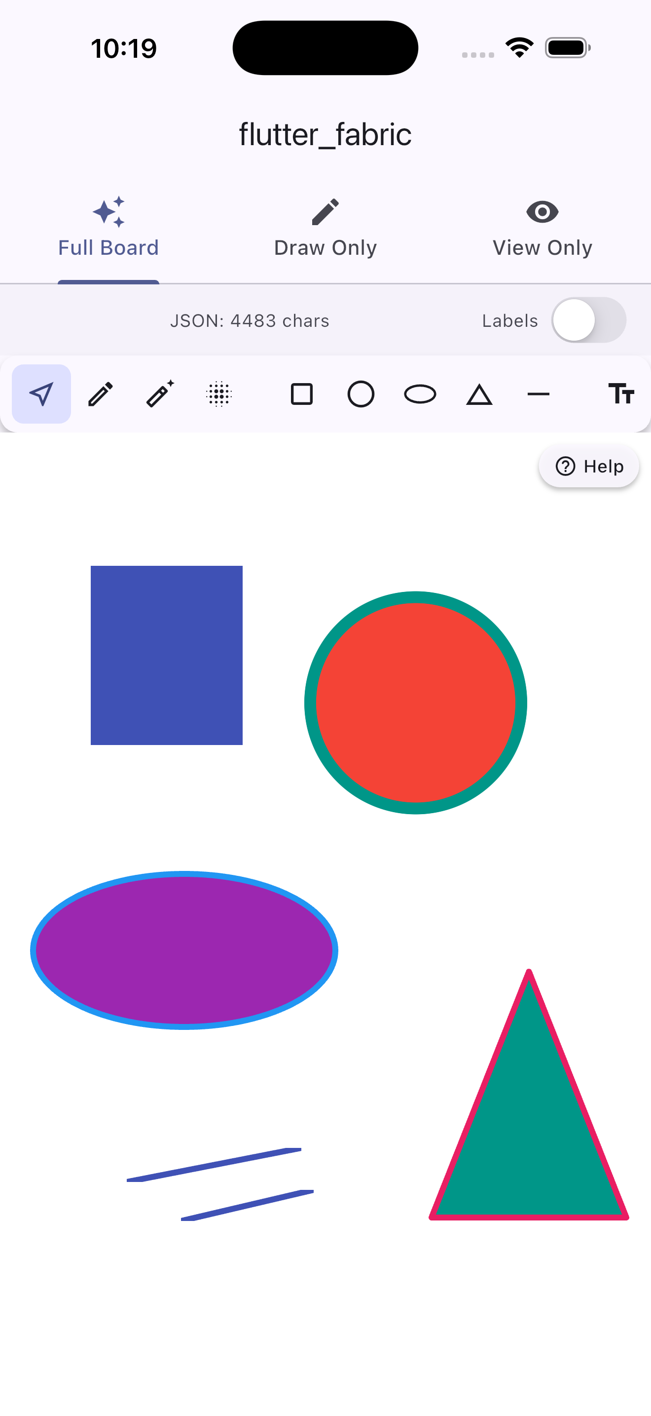
- Object types
- Brush types
- Installation
import 'package:flutter_fabric/flutter_fabric.dart';

// Minimal — a full-featured canvas with toolbar, ready to use.
@override
Widget build(BuildContext context) {
  return Scaffold(
    body: FabricBoard(
      backgroundColor: Colors.white,
    ),
  );
}
That's it. The built-in toolbar gives your users pencil, eraser, spray, 5 shapes, text tools, undo/redo, color picker, and more — all wired up out of the box.
FabricBoard is the recommended entry point. It behaves like any Flutter widget — wrap it in a Container, Expanded, AspectRatio, or whatever you need.
FabricBoard(
  // Size — omit to fill parent
  width: 800,
  height: 600,

  // Background widget (image, gradient, any Flutter widget)
  child: Image.asset('assets/bg.png', fit: BoxFit.cover),
  backgroundColor: Colors.white,

  // Feature toggles
  enableSelection: true,
  enableDrag: true,
  enablePan: true,
  enableZoom: true,
  enableMarqueeSelection: true,
  enableKeyboardShortcuts: true,
  enableDoubleTapEdit: true,
  enableLongPressMenu: true,

  // Toolbar
  showToolbar: true,
  toolbarPosition: FabricToolbarPosition.bottom,

  // Drawing defaults
  initialFillColor: Colors.blue,
  initialStrokeColor: Colors.transparent,
  initialBrushWidth: 4.0,
  initialFontSize: 24.0,

  // Callbacks
  onObjectAdded: (obj) => print('added \${obj.type}'),
  onObjectSelected: (obj) => print('selected \${obj.id}'),
  onCanvasChanged: () => print('canvas changed'),
  onReady: (controller) {
    // Programmatically add an object on startup
    controller.add(FabricRect(
      left: 50, top: 50, width: 120, height: 80,
      fill: Colors.blue,
    ));
  },
)| Parameter | Type | Description |
|---|---|---|
width |
double? |
Explicit width. When null, expands to fill parent. |
height |
double? |
Explicit height. When null, expands to fill parent. |
backgroundColor |
Color |
Canvas background color (default: Colors.white). |
child |
Widget? |
Any Flutter widget rendered behind all canvas objects. Great for background images, gradients, or grid overlays. |
// Canvas sized to an image
FabricBoard(
  width: 1024,
  height: 768,
  child: Image.network('https://example.com/photo.jpg', fit: BoxFit.cover),
)

// Canvas fills parent with a gradient background
FabricBoard(
  child: Container(
    decoration: const BoxDecoration(
      gradient: LinearGradient(colors: [Colors.purple, Colors.blue]),
    ),
  ),
)

// Canvas inside a Column
Column(
  children: [
    const Expanded(child: FabricBoard()),
    const BottomNavigationBar(...),
  ],
)Every feature can be turned off with a bool flag:
| Parameter | Default | Description |
|---|---|---|
enableSelection |
true |
Tap to select objects. |
enableDrag |
true |
Drag selected objects to move them. |
enablePan |
true |
Single-finger pan the viewport (when no object is under the finger). |
enableZoom |
true |
Pinch-to-zoom and mouse-wheel zoom. |
enableMarqueeSelection |
true |
Drag on empty canvas to rubber-band select multiple objects. |
enableKeyboardShortcuts |
true |
Del, Ctrl+Z/Y/A/C/X/V, arrow keys. |
enableDoubleTapEdit |
true |
Double-tap a text object to start inline editing. |
enableLongPressMenu |
true |
Long-press an object to show the built-in edit menu (z-order, lock, visibility, duplicate, delete). |
// Read-only canvas — users can zoom/pan but not edit
FabricBoard(
  enableDrag: false,
  enableSelection: false,
  enableMarqueeSelection: false,
  enableKeyboardShortcuts: false,
  showToolbar: false,
)

// Drawing-only canvas (no select/move)
FabricBoard(
  enableSelection: false,
  toolbarItems: const [
    FabricTool.pencil,
    FabricTool.eraser,
    FabricTool.brushWidth,
    FabricTool.colorPicker,
  ],
)| Parameter | Type | Default | Description |
|---|---|---|---|
showToolbar |
bool |
true |
Show or hide the toolbar completely. |
toolbarPosition |
FabricToolbarPosition |
bottom |
top, bottom, left, right, or floating. |
toolbarItems |
List<FabricTool>? |
all tools | Which tools to show and in what order. |
toolbarStyle |
FabricToolbarStyle |
default | Colors, icon size, elevation, padding. |
showToolbarLabels |
bool |
false |
Show a text label below each tool icon. |
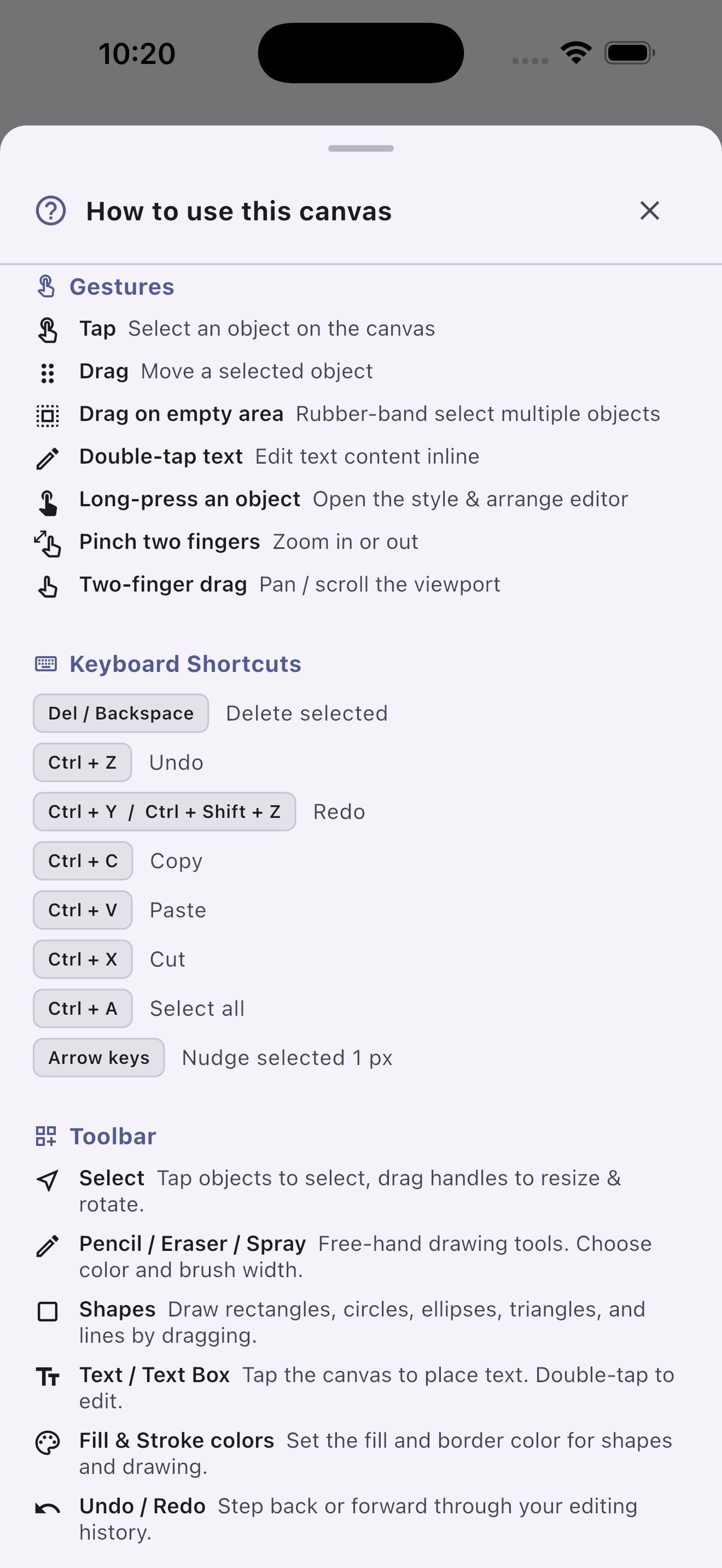
showUserGuide |
bool |
true |
Floating "Help" button — opens a context-aware guide that adapts to the active feature flags. |
All available tools:
| Tool | Kind | Description |
|---|---|---|
FabricTool.select |
mode | Tap/drag to select & move objects. |
FabricTool.pencil |
mode | Free-hand pencil drawing. |
FabricTool.eraser |
mode | Erase strokes (paints with background color). |
FabricTool.spray |
mode | Spray-paint brush. |
FabricTool.drawRect |
mode | Drag to draw a rectangle. |
FabricTool.drawCircle |
mode | Drag to draw a circle. |
FabricTool.drawEllipse |
mode | Drag to draw an ellipse. |
FabricTool.drawTriangle |
mode | Drag to draw a triangle. |
FabricTool.drawLine |
mode | Drag to draw a line. |
FabricTool.addText |
mode | Tap to place an editable text label. |
FabricTool.addTextBox |
mode | Tap to place a word-wrapping text box. |
FabricTool.undo |
action | Undo last change. |
FabricTool.redo |
action | Redo last undone change. |
FabricTool.delete |
action | Delete selected object(s). |
FabricTool.clear |
action | Remove all objects. |
FabricTool.duplicate |
action | Clone selected object(s) with a nudge. |
FabricTool.selectAll |
action | Select all visible, selectable objects. |
FabricTool.group |
action | Group selected objects. |
FabricTool.ungroup |
action | Ungroup a group. |
FabricTool.bringToFront |
action | Move object to top of z-stack. |
FabricTool.sendToBack |
action | Move object to bottom of z-stack. |
FabricTool.bringForward |
action | Move object one step forward. |
FabricTool.sendBackward |
action | Move object one step backward. |
FabricTool.flipH |
action | Flip selected object(s) horizontally. |
FabricTool.flipV |
action | Flip selected object(s) vertically. |
FabricTool.zoomIn |
action | Zoom in ×1.25. |
FabricTool.zoomOut |
action | Zoom out ×0.8. |
FabricTool.resetView |
action | Reset zoom and pan. |
FabricTool.colorPicker |
settings | Pick the fill color (opens color grid). |
FabricTool.strokeColor |
settings | Pick the stroke/border color. |
FabricTool.brushWidth |
settings | Adjust brush width 1–60 px. |
FabricTool.exportJson |
export | Opens a sheet with the canvas JSON and a Copy button. |
FabricTool.exportImage |
export | Renders the canvas to a PNG and shows a preview dialog. |
FabricTool.submit |
export | Fires the onSubmit callback with the current canvas JSON. |
FabricTool.divider |
visual | Inserts a separator line between groups. |
Custom toolbar — minimal drawing toolbar:
FabricBoard(
  toolbarItems: const [
    FabricTool.pencil,
    FabricTool.eraser,
    FabricTool.divider,
    FabricTool.colorPicker,
    FabricTool.brushWidth,
    FabricTool.divider,
    FabricTool.undo,
    FabricTool.redo,
    FabricTool.clear,
  ],
  toolbarPosition: FabricToolbarPosition.top,
)
Custom toolbar style:
FabricBoard(
  toolbarStyle: const FabricToolbarStyle(
    backgroundColor: Color(0xFF1E1E1E),
    iconColor: Colors.white70,
    selectedColor: Colors.blue,
    selectedIconColor: Colors.white,
    borderRadius: 0,
    elevation: 8,
    iconSize: 20,
  ),
)
No toolbar — fully custom UI:
final key = GlobalKey<FabricBoardState>();

// Widget tree
FabricBoard(key: key, showToolbar: false)

// Your own buttons anywhere in the app:
IconButton(
  icon: const Icon(Icons.edit),
  onPressed: () => key.currentState!.setTool(FabricTool.pencil),
)
IconButton(
  icon: const Icon(Icons.undo),
  onPressed: () => key.currentState!.controller.undo(),
)| Parameter | Type | Default | Description |
|---|---|---|---|
initialFillColor |
Color |
Colors.blue |
Starting fill color for shapes and strokes. |
initialStrokeColor |
Color |
Colors.transparent |
Starting stroke/border color. |
initialBrushWidth |
double |
4.0 |
Starting brush width in canvas pixels. |
initialFontSize |
double |
24.0 |
Starting font size for text tools. |
FabricBoard(
  onObjectAdded: (FabricObject obj) {
    print('\${obj.type} added — id: \${obj.id}');
  },
  onObjectRemoved: (FabricObject obj) {
    print('\${obj.id} removed');
  },
  onObjectModified: (FabricObject obj) {
    // Fires whenever position, size, or style changes
  },
  onObjectSelected: (FabricObject obj) {
    setState(() => _selectedId = obj.id);
  },
  onSelectionCleared: () {
    setState(() => _selectedId = null);
  },
  onDoubleTap: (Offset canvasPosition) {
    // Fires even in select mode; useful for custom context actions
  },
  onLongPress: (FabricObject obj) {
    // Only fires when enableLongPressMenu: false
    _showMyCustomSheet(obj);
  },
  onCanvasChanged: () {
    // Fires on every controller change — debounce if auto-saving
    _scheduleAutoSave();
  },
  onReady: (FabricController ctrl) {
    // Safe to populate initial objects here
    ctrl.add(FabricText('Hello World', left: 40, top: 40));
  },

  // Export & Submit callbacks (new)
  onSubmit: (String json) {
    // Called when FabricTool.submit is tapped, or key.currentState!.submit()
    sendToServer(json);
  },
  onChangeJsonData: (String json) {
    // Fires on every canvas change — debounce for heavy operations
    setState(() => _liveJson = json);
  },
)final _boardKey = GlobalKey<FabricBoardState>();
@override
Widget build(BuildContext context) {
return FabricBoard(key: _boardKey);
}
// Add objects
void _addRect() {
_boardKey.currentState!.controller.add(
FabricRect(left: 100, top: 100, width: 200, height: 120, fill: Colors.red),
);
}
// Switch tools
void _startDrawing() => _boardKey.currentState!.setTool(FabricTool.pencil);
// Change color
void _setGreen() => _boardKey.currentState!.fillColor = Colors.green;
// Export JSON
String get _json => _boardKey.currentState!.exportJson();
// Export PNG (returns Uint8List?)
Future<void> _savePng() async {
final bytes = await _boardKey.currentState!.exportImage(pixelRatio: 2.0);
// bytes can be saved to disk, sent to a server, or shared
}
// Submit (fires onSubmit callback)
void _handleSubmit() => _boardKey.currentState!.submit();For maximum control, use FabricController and FabricCanvas directly.
class MyEditor extends StatefulWidget {
  const MyEditor({super.key});
  @override
  State<MyEditor> createState() => _MyEditorState();
}

class _MyEditorState extends State<MyEditor> {
  final _ctrl = FabricController(backgroundColor: Colors.white);

  @override
  void dispose() {
    _ctrl.dispose();
    super.dispose();
  }

  @override
  Widget build(BuildContext context) {
    return FabricCanvas(
      controller: _ctrl,
      enablePan: true,
      enableZoom: true,
      enableSelection: true,
      enableDrag: true,
      enableMarqueeSelection: true,
      enableKeyboardShortcuts: true,
      enableDoubleTapEdit: true,
      onTapObject: (obj) => print('tapped \${obj.id}'),
      onDoubleTap: (pos) => print('double-tap at \$pos'),
    );
  }
}controller.interactionMode drives everything:
// Select & move objects (default)
ctrl.interactionMode = FabricInteractionMode.select;

// Free-hand drawing
ctrl.freeDrawingBrush = PencilBrush()..color = Colors.black..width = 4;
ctrl.interactionMode = FabricInteractionMode.pencil;

// Drag to draw shapes — set creation defaults first
ctrl.activeFillColor = Colors.blue;
ctrl.activeStrokeColor = Colors.transparent;
ctrl.activeStrokeWidth = 1.0;
ctrl.interactionMode = FabricInteractionMode.drawRect;

// Tap to add text
ctrl.activeFillColor = Colors.black;
ctrl.activeFontSize = 24.0;
ctrl.interactionMode = FabricInteractionMode.addText;| Mode | Gesture |
|---|---|
select |
Tap to select; drag to move; pinch to zoom. |
pencil |
Free-hand strokes. |
eraser |
Erase by painting with background color. |
spray |
Spray-paint strokes. |
drawRect |
Drag → FabricRect. |
drawCircle |
Drag → FabricCircle. |
drawEllipse |
Drag → FabricEllipse. |
drawTriangle |
Drag → FabricTriangle. |
drawLine |
Drag → FabricLine. |
addText |
Tap → FabricIText (opens inline editor). |
addTextBox |
Tap → FabricTextBox. |
| Shortcut | Action |
|---|---|
Delete / Backspace |
Delete selected object(s). |
Ctrl + A |
Select all. |
Ctrl + C |
Copy selected. |
Ctrl + X |
Cut selected. |
Ctrl + V |
Paste. |
Ctrl + Z |
Undo. |
Ctrl + Shift + Z / Ctrl + Y |
Redo. |
Arrow keys |
Nudge selected object 1 px. |
if (ctrl.canUndo) ctrl.undo();
if (ctrl.canRedo) ctrl.redo();
Up to 50 history states are kept automatically.
ctrl.copyActiveObjects();
ctrl.pasteObjects();       // pastes with a 10 px nudge
ctrl.cutActiveObjects();ctrl.zoomTo(2.0);
ctrl.zoomToPoint(const Offset(300, 200), 1.5);
ctrl.panBy(const Offset(50, 0));
ctrl.resetViewport();final json = ctrl.toJson(); // export
ctrl.loadFromJson(json); // import (adds to undo stack)final svgString = ctrl.toSvg(width: 800, height: 600);Low-level — via FabricController:
// toImage returns a dart:ui Image at the given logical size
final uiImage = await ctrl.toImage(const Size(800, 600));
final byteData = await uiImage.toByteData(format: ui.ImageByteFormat.png);
final bytes = byteData!.buffer.asUint8List();

// exportPng — convenience wrapper that returns Uint8List directly
// size defaults to a tight bounding box around all objects
final Uint8List? bytes = await ctrl.exportPng(pixelRatio: 2.0);
final Uint8List? bytes2 = await ctrl.exportPng(
  pixelRatio: 3.0,
  size: const Size(1920, 1080),
);
High-level — via FabricBoardState:
final key = GlobalKey<FabricBoardState>();

// Returns Uint8List? (null if canvas is empty or rendering fails)
final bytes = await key.currentState!.exportImage(pixelRatio: 2.0);

// The built-in toolbar button FabricTool.exportImage shows a live preview dialog.
// Add it to your toolbarItems to give users a one-tap export.FabricBoard exposes three callbacks and three matching public methods for
getting data out of the canvas.
| Callback | Fires when | Receives |
|---|---|---|
onSubmit |
FabricTool.submit tapped, or state.submit() called |
String json |
onChangeJsonData |
Any canvas change (add, move, style, undo, …) | String json (full canvas) |
FabricBoard(
  // Real-time JSON — ideal for auto-save or live preview
  onChangeJsonData: (json) => _autoSave(json),

  // Called by the Submit toolbar button or state.submit()
  onSubmit: (json) => submitForm(json),

  toolbarItems: const [
    // ... other tools ...
    FabricTool.divider,
    FabricTool.exportJson,   // pretty-print JSON sheet + copy
    FabricTool.exportImage,  // live PNG preview dialog
    FabricTool.submit,       // fires onSubmit
  ],
)
Programmatic equivalents (all available via GlobalKey<FabricBoardState>):
// Snapshot the canvas as JSON string
String json = key.currentState!.exportJson();

// Render to PNG bytes (async)
Uint8List? bytes = await key.currentState!.exportImage(pixelRatio: 2.0);

// Fire onSubmit callback manually
key.currentState!.submit();
Debounce
onChangeJsonDatawhen wiring it to heavy operations such as network saves, because it fires on everynotifyListeners()call from the controller (dragging an object fires it on every frame).
| Class | Key parameters |
|---|---|
FabricRect |
left, top, width, height, fill, stroke, strokeWidth |
FabricCircle |
left, top, radius, fill, stroke, startAngle, endAngle |
FabricEllipse |
left, top, rx, ry, fill, stroke |
FabricTriangle |
left, top, width, height, fill, stroke |
FabricLine |
x1, y1, x2, y2, stroke, strokeWidth |
FabricPolygon |
points (List<Offset>), fill, stroke |
FabricPolyline |
points (List<Offset>), stroke, strokeWidth |
FabricPath |
pathData (SVG path string), fill, stroke |
FabricText |
text, left, top, fontSize, fontWeight, fontFamily, fill |
FabricIText |
same as FabricText — double-tap to edit inline |
FabricTextBox |
same + fixedWidth — word-wraps content |
FabricImage |
image (ui.Image), left, top, width, height |
FabricGroup |
objects (List<FabricObject>) |
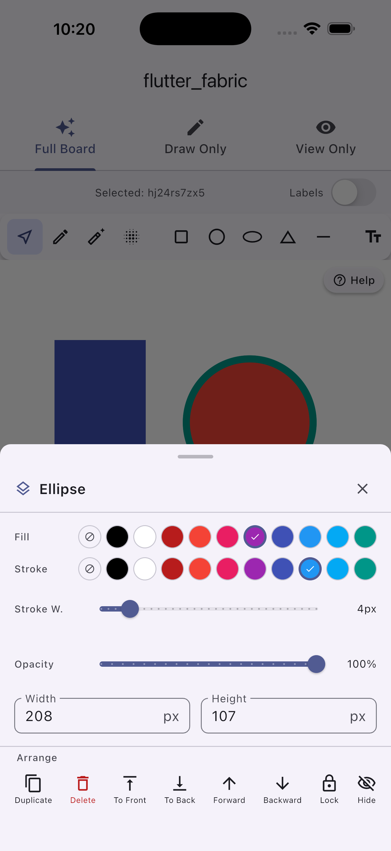
Shared base properties on every object:
| Property | Type | Description |
|---|---|---|
left, top |
double |
Canvas position. |
width, height |
double |
Bounding box size. |
scaleX, scaleY |
double |
Scale multiplier (default 1.0). |
angle |
double |
Rotation in degrees. |
opacity |
double |
0.0–1.0. |
fill |
Color |
Fill color. |
stroke |
Color |
Stroke/border color. |
strokeWidth |
double |
Stroke width. |
flipX, flipY |
bool |
Mirror the object. |
skewX, skewY |
double |
Skew in degrees. |
selectable |
bool |
Responds to tap/selection. |
visible |
bool |
Whether the object is rendered. |
lockMovementX/Y |
bool |
Prevent horizontal/vertical dragging. |
id |
String |
Auto-generated UUID, or pass your own. |
blendMode |
BlendMode |
Compositing blend mode. |
// Non-interactive watermark
ctrl.add(FabricText(
  '© My App',
  left: 10, top: 10,
  fontSize: 14,
  fill: Colors.black26,
  selectable: false,
));

// Locked background rectangle
ctrl.add(FabricRect(
  left: 0, top: 0, width: 800, height: 600,
  fill: Colors.grey.shade100,
  selectable: false,
  lockMovementX: true,
  lockMovementY: true,
));| Class | Key parameters | Description |
|---|---|---|
PencilBrush |
color, width |
Smooth Bezier-curved strokes. |
EraserBrush |
width |
Erases by painting with background color. |
SprayBrush |
color, width, density, dotSize |
Spray-paint particle effect. |
PatternBrush |
color, width, spacing |
Repeating stamp pattern. |
ctrl.freeDrawingBrush = PencilBrush()..color = Colors.red..width = 6;
ctrl.interactionMode = FabricInteractionMode.pencil;Add to pubspec.yaml:
dependencies:
  flutter_fabric: ^1.0.0
Then:
import 'package:flutter_fabric/flutter_fabric.dart';