
A Flutter package that floats any widget above your content and reacts to scrolling. Use it as a tab bar, bottom navigation bar, search bar, command surface, or any custom child.





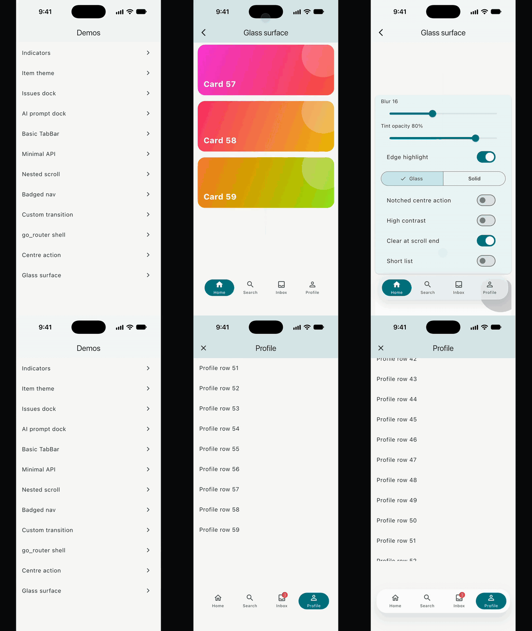
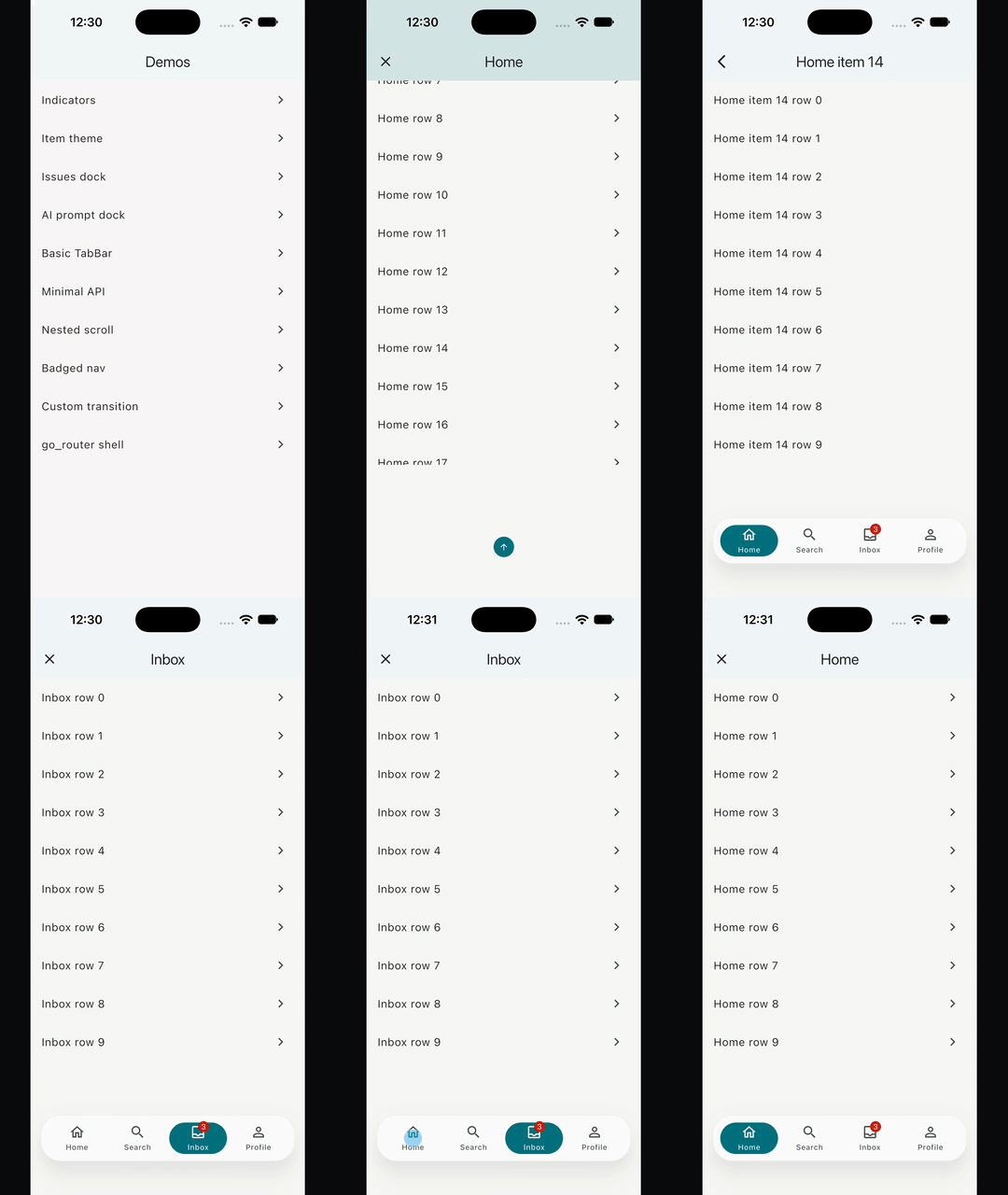
Try it live. Every demo runs in your browser. Link one demo with #/<demo>, for example #/issues-dock.
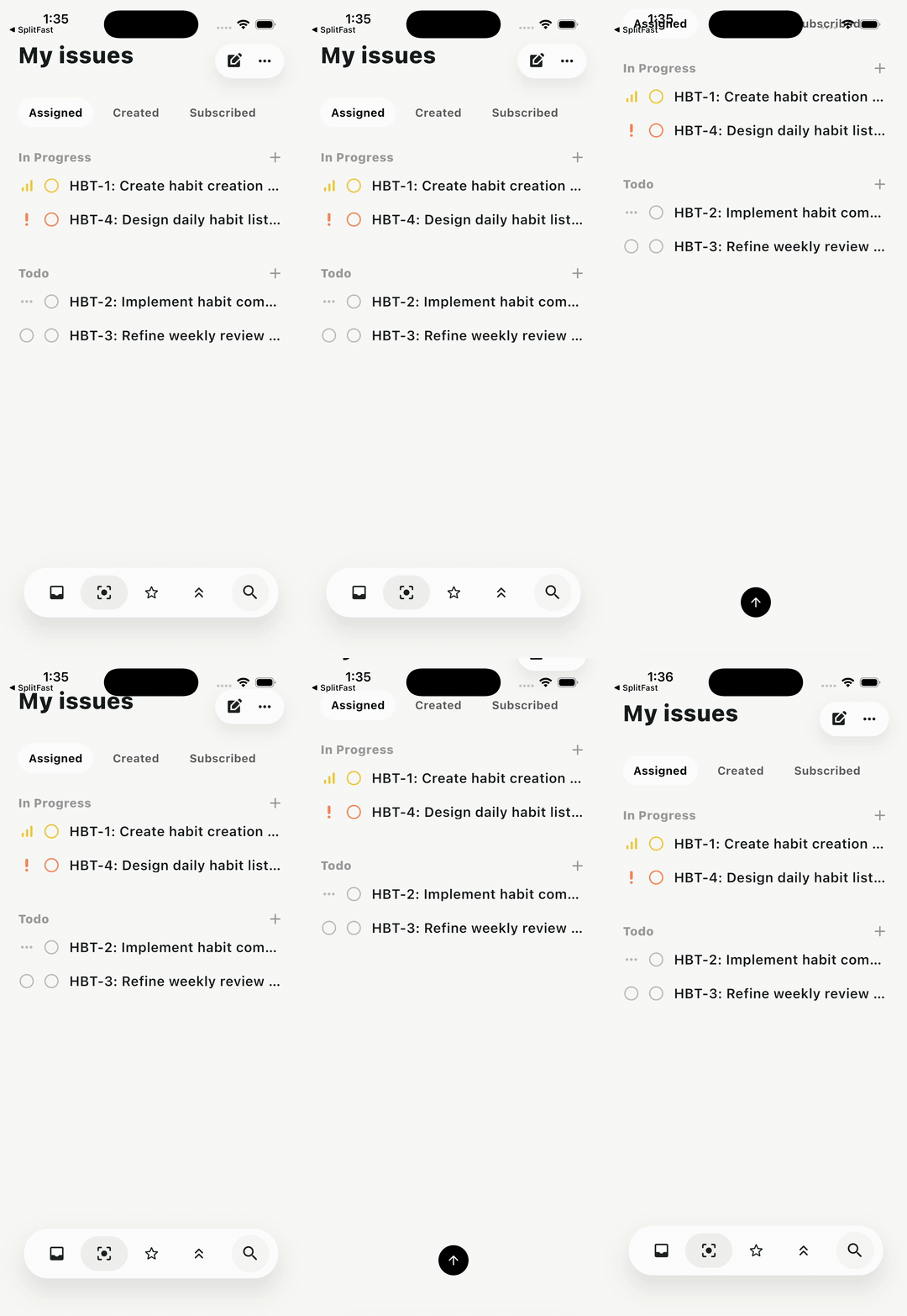 |
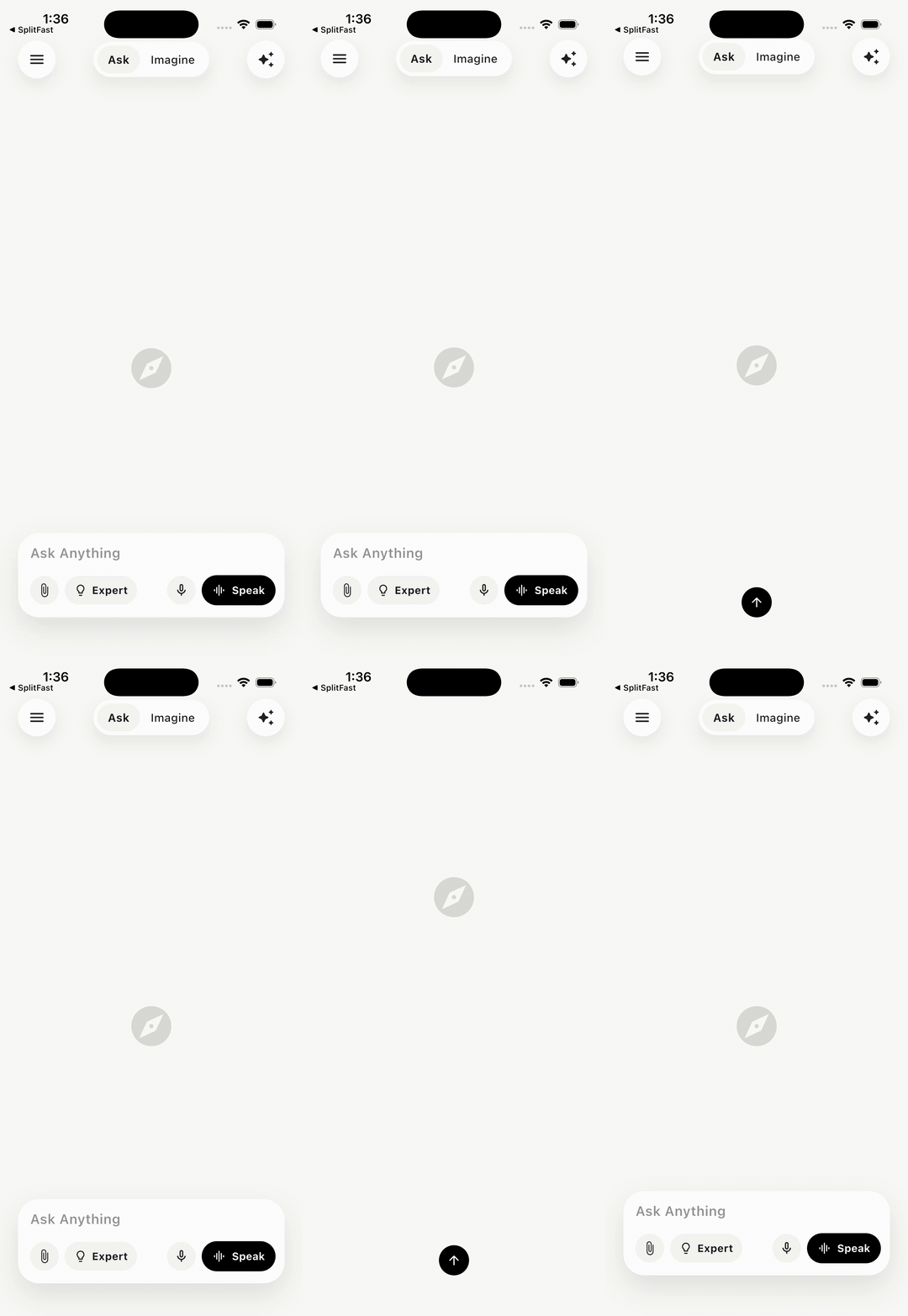 |
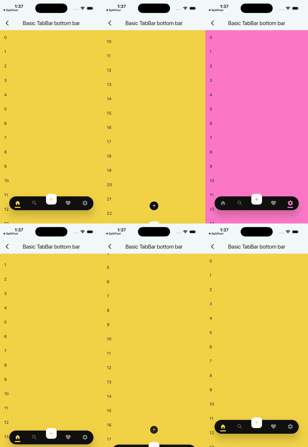 |
|---|---|---|
| Issues dock | AI prompt dock | Basic TabBar |
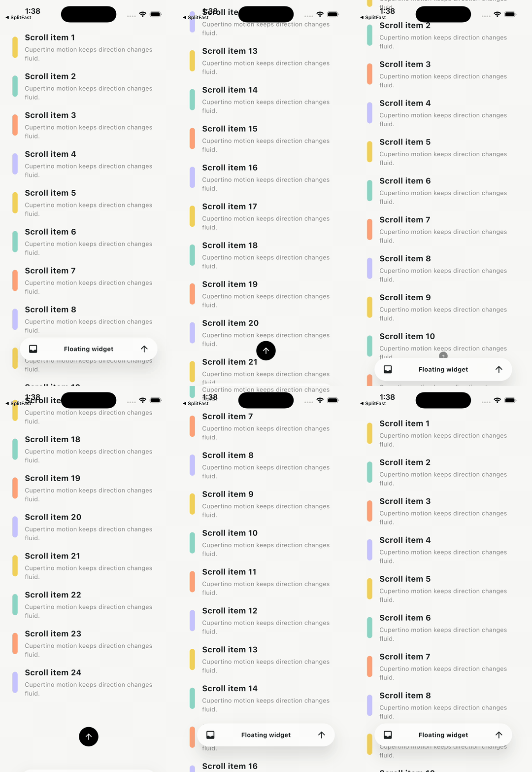 |
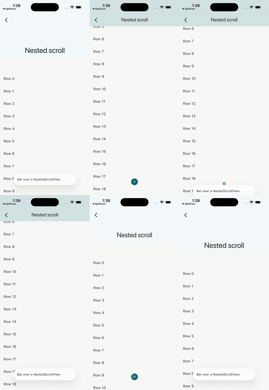 |
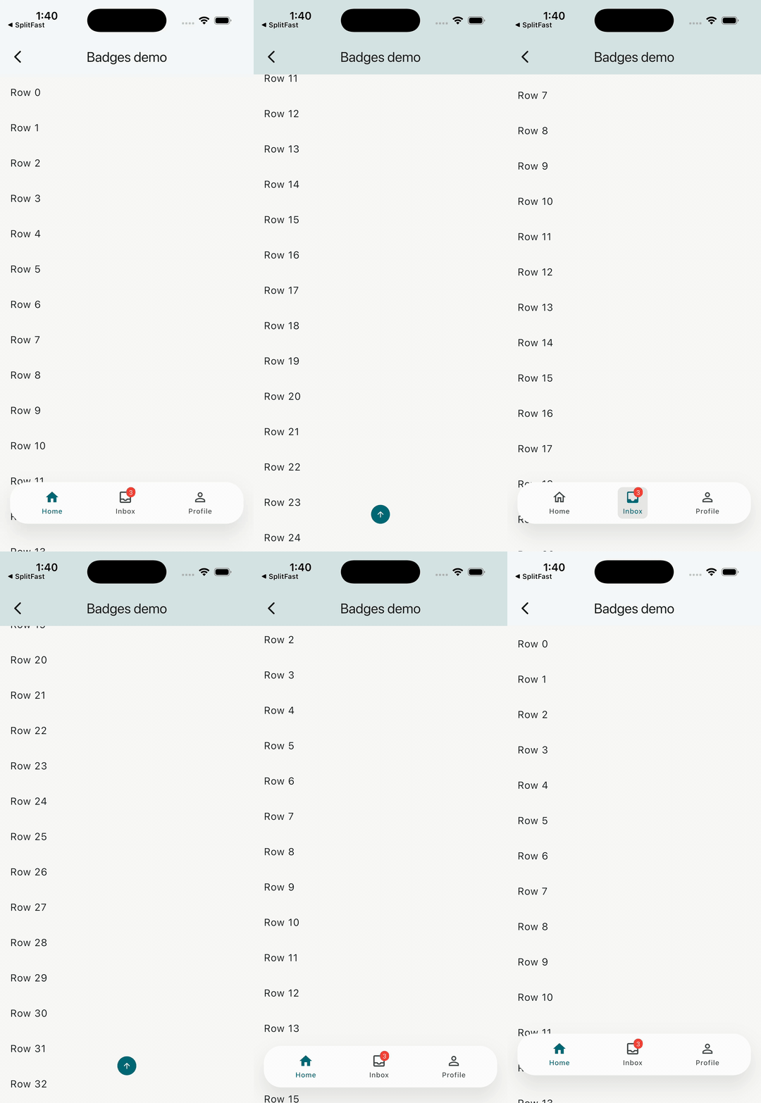 |
| Minimal API | Nested scroll | Badged nav |
 |
 |
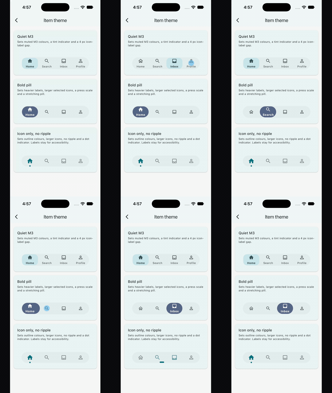 |
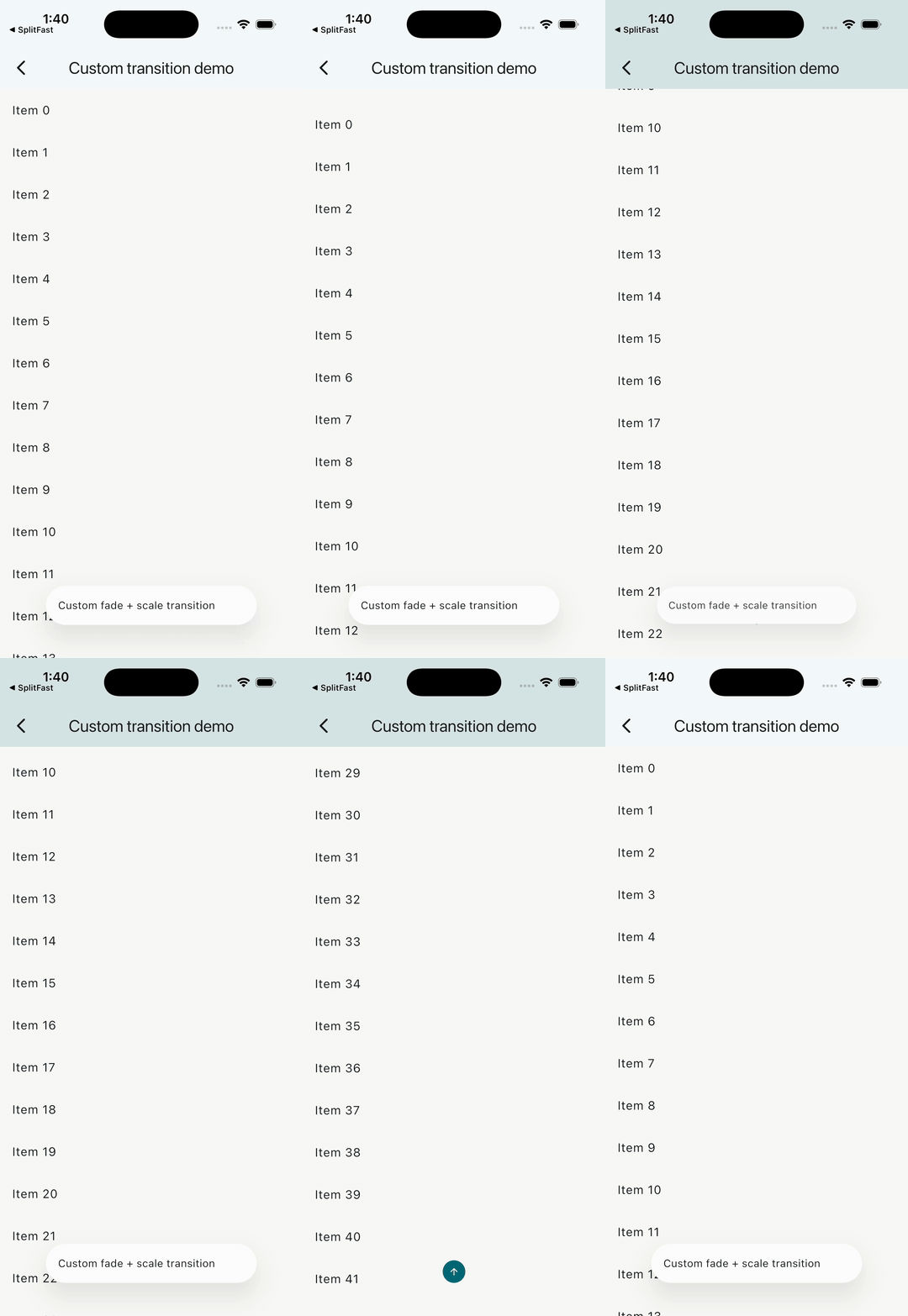
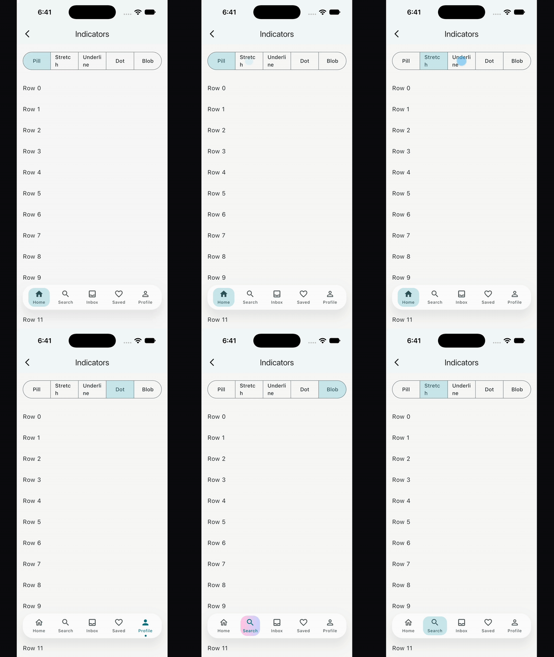
| Custom transition | Indicators | Item theme |
 |
 |
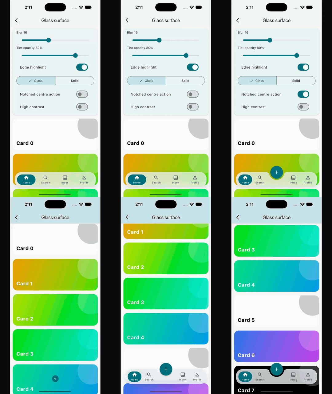 |
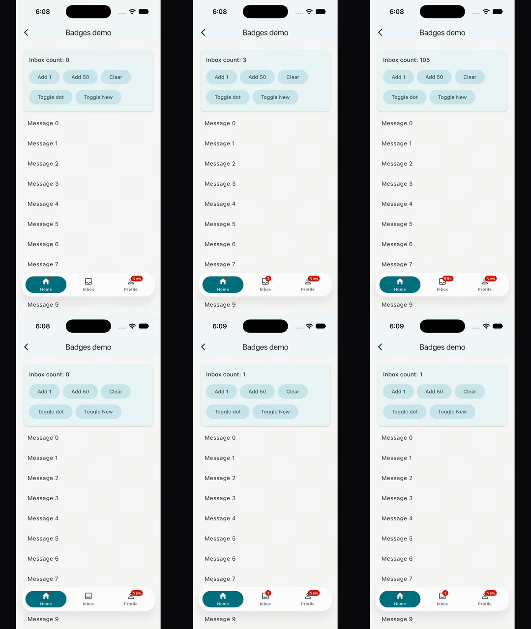
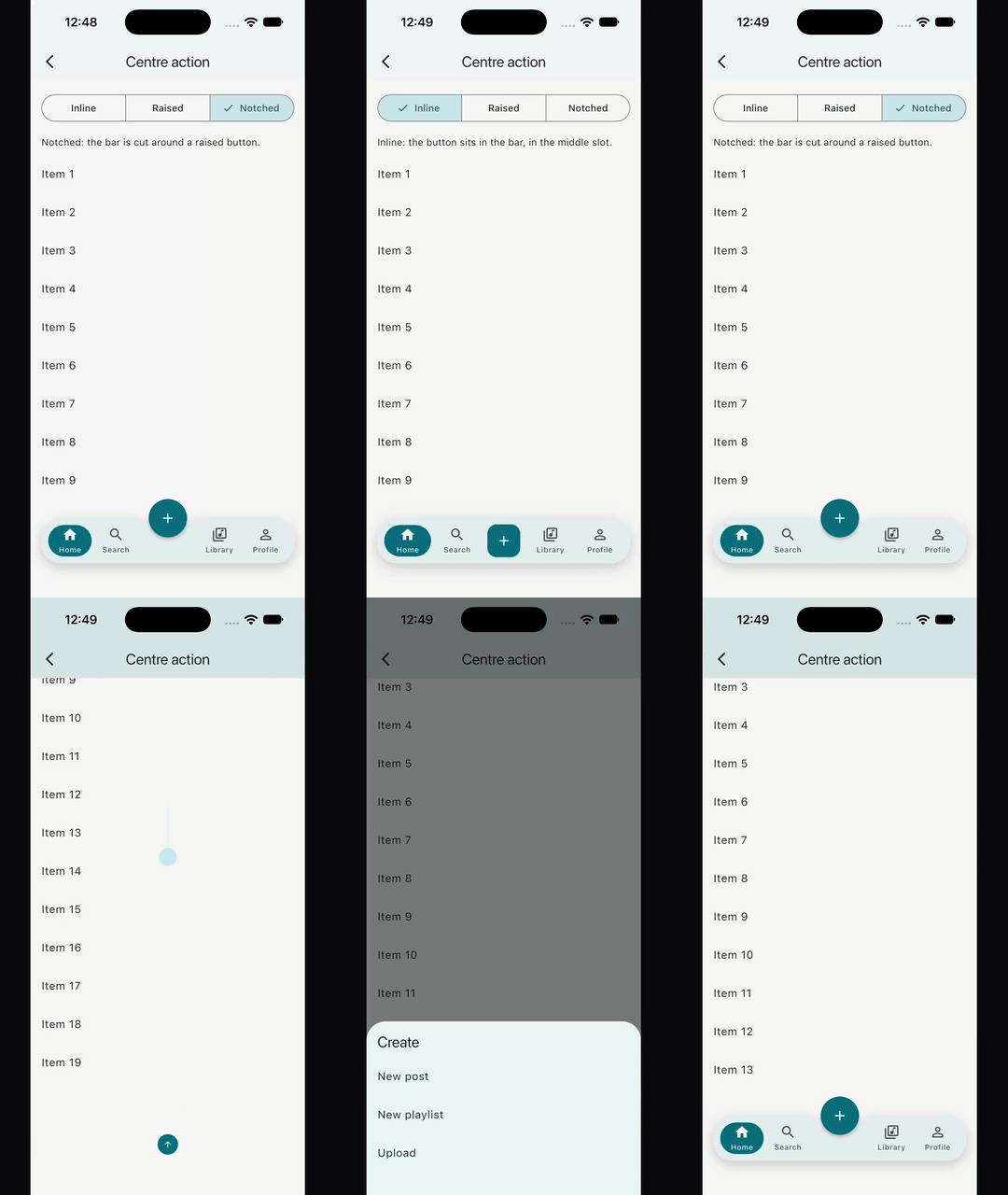
| Badges | Centre action | Glass surface |
 |
 |
|
| Scroll edge surface | go_router shell |
- Host any widget as the floating bar:
TabBar,BottomBarItems, a search composer, or a customRow. - Scroll detection is notification-based. Most setups need no
ScrollControllerplumbing. BottomBarLayout.adaptive(maxWidth: ...)fills the host width while keeping a hard cap for tablets, desktop, and wide layouts.BottomBarBodyPaddingreserves the bar's full measured footprint, including configured offset and bottom safe-area, so body content stays clear even while the bar is hidden.BottomBarMotion()defaults to Motor-backed Cupertino spring motion with velocity-preserving redirects when scroll direction changes mid-animation.- Custom transitions are supported, but they must stay paint-only and preserve the child's layout footprint.
- Indicators: a pill, tint, underline, dot or custom indicator springs between
BottomBarItems. Demo. - Item theme:
BottomBarItemThemeDatastyles and animates everyBottomBarItemwithout a fork. Demo. - Badges:
BottomBarBadge.dot(),.count()and.label()scale in and roll their digits. Demo. - Reselect and gestures: reselect to scroll to top, long-press, haptics and drag-to-select. Demo.
- Centre action: an inline, raised or notched button in the middle of the row. Demo.
- Glass surface:
BottomBarThemeData.surfacepaints the bar as frosted glass or a solid fill, andscrollEdgeSurfacechanges it when nothing scrolls under the bar. Demo. - Works with go_router: a
StatefulShellRouterecipe, with no go_router dependency in the package. Demo. - Adaptive rail shows a bar on narrow windows and a navigation rail on wide ones, from the same
BottomBarItems. - The hidden action is accessibility-safe by default: it is non-interactive and
excluded from semantics while the bar is visible, keeps at least a 48x48 hit
target when active, uses direction-aware icon/tooltip text, and defaults its
glyph color to
ColorScheme.onPrimary. - Reduced-motion environments snap directly to the final shown/hidden state.
BottomBarControllersupports imperative show/hide plusscrollToStart()/scrollToEnd(), including correctNestedScrollViewboundary targeting.Motionfrom themotorpackage is re-exported intentionally forBottomBarMotion.motor(...).
Requires Dart >=3.12.0 and Flutter >=3.44.0.
See the 3.1.0 release notes for the complete list of new indicator, item theme, badge, gesture, centre action and surface features.
flutter pub add flutter_floating_bottom_bar:^3.1.0import 'package:flutter_floating_bottom_bar/flutter_floating_bottom_bar.dart';If you use Claude Code, this repo ships a skill for integration, migration, and debugging help around this package.
Install by copying .claude/skills/flutter-floating-bottom-bar/
into your Claude skills directory.
BottomBar(
  layout: const BottomBarLayout.adaptive(
    maxWidth: 420,
    borderRadius: BorderRadius.all(Radius.circular(999)),
  ),
  body: BottomBarBodyPadding(
    padding: const EdgeInsets.only(top: 24),
    child: ListView.builder(
      padding: const EdgeInsets.symmetric(horizontal: 16),
      itemCount: 50,
      itemBuilder: (_, index) => ListTile(title: Text('Item $index')),
    ),
  ),
  child: const Padding(
    padding: EdgeInsets.symmetric(horizontal: 16, vertical: 14),
    child: Row(
      mainAxisAlignment: MainAxisAlignment.spaceBetween,
      children: [
        Icon(Icons.home_rounded),
        Text('Floating bar'),
        Icon(Icons.search_rounded),
      ],
    ),
  ),
)
BottomBar needs two required arguments:
body: the subtree that emitsScrollNotifications.child: the floating widget shown above that body.
The bar is stacked above the body, so use BottomBarBodyPadding when your body
should reserve enough bottom space to stay clear of the bar.
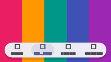
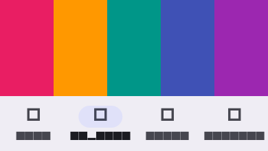
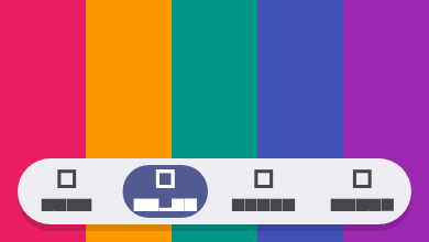
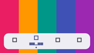
A preset is one line to a finished bar, and each one is a plain BottomBarThemeData that works as theme: or in ThemeData.extensions. It takes colours from your ColorScheme, so light, dark and dynamic colour work.
| Glass | Material 3 |
|---|---|
 |
 |
| Pill | Minimal |
 |
 |
BottomBar(theme: BottomBarThemeData.glass(), body: body, child: items)      // iOS 26 glass capsule
BottomBar(theme: BottomBarThemeData.material3(), body: body, child: items)  // Flutter's NavigationBar
BottomBar(theme: BottomBarThemeData.pill(), body: body, child: items)       // rounded bar, sliding pill
BottomBar(theme: BottomBarThemeData.minimal(), body: body, child: items) // flat bar, dot indicatorglass()is the iOS 26 tab bar. It is a floating glass capsule that clears at the scroll edge. A tinted capsule sits behind the selected item, with springs and a selection haptic. The glass is 98% opaque, so labels keep 4.5:1 contrast over a white or a black backdrop.accentcolours the selected item and its tint.indicatorreplaces the tint.material3()matches the size and indicator of Flutter's Material 3NavigationBar. The bar is docked, full width, on a solidsurfaceContainer, and 80 px tall, with a 64 x 32 stadium. ItsBottomBarIndicator.container()gives the selected icononSecondaryContainerand the selected labelonSurface, asNavigationBardoes.backgroundColorandindicatorColorreplace the two fills.pill()is a floating, fully rounded, solid bar with a soft shadow. A sliding pill sits behind the selected item, with a small press scale and a selection haptic. The content under the pill takes black or white for contrast.accentfills the pill.indicatorreplaces it.minimal()is a flat floating bar with no shadow. A dot sits under the selected item, with no ink and short, quiet motion. The bar fades instead of sliding.accentcolours the selected item and the dot.indicatorreplaces the dot, for example withBottomBarIndicator.underline(). Only the selected item shows its label. SetlabelBehavioronBottomBarItemsor on the item theme to change that.
To change a preset, use copyWith or merge.
The material3(), pill() and minimal() presets keep their surface at the
scroll edge. Merging one over glass() resets the glass edge surface. If you
replace a preset's surface with copyWith and want the same surface at the
edge, set scrollEdgeSurface to that surface too.
// Change one field.
BottomBarThemeData.pill(accent: Colors.teal).copyWith(
  motion: const BottomBarMotion.curved(),
);

// Layer your own theme on top. Null fields keep the preset's value.
BottomBarThemeData.glass().merge(
  const BottomBarThemeData(
    items: BottomBarItemThemeData(haptics: BottomBarHaptics.none),
  ),
);

// App-wide.
ThemeData(extensions: [BottomBarThemeData.material3()]);
Try the presets demo live.
Use BottomBarLayout.adaptive(maxWidth: ...) to span narrow screens while
stopping at a defined maximum on wide screens. Pair it with
BottomBarBodyPadding when the body should reserve the full footprint.
BottomBar(
  layout: const BottomBarLayout.adaptive(maxWidth: 440),
  body: const BottomBarBodyPadding(
    child: CustomScrollView(
      slivers: [
        SliverAppBar(title: Text('Inbox')),
        SliverList.list(
          children: [
            ListTile(title: Text('Message 1')),
            ListTile(title: Text('Message 2')),
          ],
        ),
      ],
    ),
  ),
  child: const SizedBox(
    height: 56,
    child: Center(child: Text('Compose')),
  ),
)
BottomBarScope.barHeight and BottomBarBodyPadding use the bar's measured
layout footprint, not its animated transform. The reported value includes the
bar height plus configured layout.offset and bottom safe-area when
respectSafeArea is enabled.
BottomBarController.scrollToStart() always targets the minimum extent and
scrollToEnd() always targets the maximum extent. In a NestedScrollView, the
controller automatically chooses the correct coordinated boundary controller:
scrollToStart()drives the outer controller so pinned/expanded header slivers return to their true top state.scrollToEnd()drives the inner controller so the body scrolls to the end and the header collapses naturally.
If your body emits unrelated notifications, use
BottomBarScrollBehavior.predicate to filter them.
BottomBar(
  controller: controller,
  scrollBehavior: BottomBarScrollBehavior(
    predicate: (notification) => notification.depth == 0,
    showAtStart: true,
    showOnScrollEnd: true,
  ),
  body: NestedScrollView(
    headerSliverBuilder: (_, __) => const [
      SliverAppBar(
        pinned: true,
        expandedHeight: 180,
        flexibleSpace: FlexibleSpaceBar(title: Text('Nested scroll')),
      ),
    ],
    body: ListView.builder(
      itemCount: 100,
      itemBuilder: (_, index) => ListTile(title: Text('Row $index')),
    ),
  ),
  child: const SizedBox(
    height: 56,
    child: Center(child: Text('Scroll-aware')),
  ),
)BottomBar normally drives visibility from ScrollNotifications bubbled up
from body. Some content — most notably an embedded WebView — scrolls
internally without ever emitting one. For those cases, call
BottomBarController.reportScroll from the WebView's own scroll callback:
controller.reportScroll(delta: newPixels - oldPixels);This drives the same threshold/reverse/hideOnScroll visibility rules as
body scrolling. It only affects visibility — scrollToStart()/scrollToEnd()
still require a real ScrollPosition, which a WebView cannot provide.
Custom transition builders must preserve the child's layout footprint. Use
paint-only wrappers such as Opacity, Transform.translate, or
Transform.scale.
Do not use layout-changing widgets such as SizeTransition or Align with a
heightFactor; those break the stable footprint contract used by
BottomBarScope.barHeight and BottomBarBodyPadding.
BottomBar(
  motion: BottomBarMotion(
    transitionBuilder: (context, animation, child) {
      final value = animation.value.clamp(0.0, 1.0);
      return Opacity(
        opacity: value,
        child: Transform.scale(
          scale: 0.92 + (0.08 * value),
          child: child,
        ),
      );
    },
  ),
  body: ListView.builder(
    itemCount: 100,
    itemBuilder: (_, index) => ListTile(title: Text('Row $index')),
  ),
  child: const SizedBox(
    height: 56,
    child: Center(child: Text('Paint-only transition')),
  ),
)
Spring progress can overshoot. Clamp animation.value before using it for
opacity or scale.
BottomBarItems is a row helper. BottomBarItem is an opinionated item widget
with built-in accessibility and RTL-aware badge placement.
- A
BottomBarBadgesits on the icon's top-end corner and mirrors in RTL. Any otherbadgewidget usesPositionedDirectional, so it follows the top-end corner in both LTR and RTL layouts. See Badges. - The item exposes button semantics, selection state, and enabled state.
- The tappable surface keeps at least a 48x48 target.
- Accessible naming is deterministic:
semanticLabelwins, otherwisetooltip, otherwise descendant semantics. - When
semanticLabelortooltipprovides the explicit accessible name, descendant semantics are excluded to avoid duplicate announcements. - In bounded rows wide enough for each item's 48x48 minimum target,
BottomBarItemswraps every child inExpanded, so items share the row's width equally. Narrow bounded rows use a horizontal scroll view to preserve the minimum targets; unbounded rows keep their raw children. - A
BottomBarItem'sTextlabel (with non-nulldata) is truncated to a single line with an ellipsis.Text.richand other label widgets are left untouched. BottomBarItems.labelBehaviorcontrols when descendant labels render:alwaysShow,onlySelected, oralwaysHide. A row with no argument usesBottomBarItemThemeData.labelBehavior, thenalwaysShow. An item used outside aBottomBarItemsrow always shows its label.
BottomBarItems can own selection and draw an indicator that slides between
items on a spring. The indicator carries its momentum when you tap again
mid-flight, and it jumps under reduced motion.
int index = 0;

BottomBarItems(
  selectedIndex: index,
  onSelected: (i) => setState(() => index = i),
  indicator: const BottomBarIndicator.pill(),
  children: [
    BottomBarItem(icon: const Icon(Icons.home), label: const Text('Home')),
    BottomBarItem(icon: const Icon(Icons.search), label: const Text('Search')),
  ],
)BottomBarIndicator.pill()is a solid capsule that fills the item's slot. Addstretch: trueto make it stretch as it travels.BottomBarIndicator.tint()is a soft wash with accent-coloured content.BottomBarIndicator.underline()is a bar under the content that stretches like a worm as it moves.BottomBarIndicator.dot()is a dot that stretches into a capsule as it moves.BottomBarIndicator.container()is Material 3's 64 x 32 capsule behind the icon, insecondaryContainer. The selected icon takesonSecondaryContainerand the selected labelonSurface.BottomBarIndicator.builder((context, rect, settled) => ...)draws your own indicator at the animated rect. The example app'sindicatorsdemo builds a "tubelight" with it.
The pill, tint and underline styles show the selected colour and
selectedIcon only where they cover an item. While the pill slides, a label
changes colour exactly where the pill passes over it.
When selectedIndex is set, it wins over BottomBarItem.selected. Tapping an
item runs its onTap, then onSelected. An item's selectedColor overrides
the indicator's foreground colour.
Style and animate every BottomBarItem through BottomBarItemThemeData, set as BottomBarThemeData.items, without forking the widget.
It sets:
- Colours, through
colorandselectedColor. - Icon sizes, through
iconSizeandselectedIconSize. - Label styles, through
labelStyleandselectedLabelStyle. A heavier selected weight animates in. - Padding and the gap between icon and label, through
paddingandiconLabelGap. - Ink radius, overlay and splash, through
inkBorderRadius,overlayColorandsplashFactory.NoSplash.splashFactoryremoves the ripple. pressedScale, which scales the icon and label while the item is pressed.- The
motionspring for item transitions. - The default
indicatorandindicatorMotionforBottomBarItemsrows.
Precedence, lowest to highest:
- Built-in defaults.
ThemeData.extensions.BottomBar(theme:).BottomBarItemsarguments (indicator,indicatorMotion). An indicator's foreground colour beatsselectedColor.BottomBarItemarguments (color,selectedColor).
Items outside a BottomBar read the ThemeData.extensions level only. Use BottomBarIndicator.none() to opt one row out of a theme indicator.
Selection changes animate colour, icon and label style on a spring; with BottomBarLabelBehavior.onlySelected the label grows in and the indicator follows it, and reduced motion skips all of it.
MaterialApp(
  theme: ThemeData(
    extensions: const [
      BottomBarThemeData(
        items: BottomBarItemThemeData(
          selectedLabelStyle: TextStyle(fontWeight: FontWeight.w700),
          pressedScale: 0.92,
          indicator: BottomBarIndicator.pill(),
        ),
      ),
    ],
  ),
  home: ...,
);BottomBarBadge puts a dot, a count or a short label on an item's icon. Pass
it to BottomBarItem.badge.
BottomBarItems(
  selectedIndex: index,
  onSelected: (i) => setState(() => index = i),
  children: [
    BottomBarItem(
      icon: const Icon(Icons.home_outlined),
      label: const Text('Home'),
      badge: BottomBarBadge.dot(show: hasUpdate),
    ),
    BottomBarItem(
      icon: const Icon(Icons.inbox_outlined),
      label: const Text('Inbox'),
      badge: BottomBarBadge.count(unread, semanticLabel: '$unread new'),
    ),
    BottomBarItem(
      icon: const Icon(Icons.person_outline),
      label: const Text('Profile'),
      badge: BottomBarBadge.label('New', show: isNew),
    ),
  ],
).dot()is a small dot with no text..count(n)shows the number. Abovemax, which defaults to 99, it shows "99+". At 0 it hides unlessshowZerois true..label('New')shows a short word. It hides when the text is empty.
Badges scale in with a slight overshoot and scale out before they go. A count rolls its digits up when it grows and down when it shrinks. The width follows the text. Reduced motion snaps every change.
Hide a badge with show: false or a count of 0, not with a null badge. That
way the out animation can play.
outline draws a ring that separates the badge from the icon. Use the surface
colour, such as BorderSide(color: colorScheme.surface, width: 2). offset
shifts the badge. Positive x moves it toward the item's end, and positive y
moves it down.
Style every badge through BottomBarBadgeThemeData, set as
BottomBarItemThemeData.badge:
BottomBarThemeData(
  items: BottomBarItemThemeData(
    badge: BottomBarBadgeThemeData(
      backgroundColor: colorScheme.primary,
      textColor: colorScheme.onPrimary,
      textStyle: textTheme.labelSmall,
      dotSize: 8,
      height: 18,
      padding: const EdgeInsets.symmetric(horizontal: 5),
      offset: const Offset(-2, 0),
      outlineColor: colorScheme.surface,
      outlineWidth: 2,
      motion: Motion.snappySpring(),
    ),
  ),
)
The fields are backgroundColor, textColor, textStyle, dotSize,
height, padding, offset, outlineColor, outlineWidth and motion.
Every field is optional. Arguments on a badge win over the theme.
The item announces its name and its badge, as in "Inbox, 3 new". A count
announces the text it shows by default, such as "3" or "99+". A label
announces its text. A dot is silent unless it has a semanticLabel.
To localize, pass a translated semanticLabel:
BottomBarBadge.count(
  unread,
  semanticLabel: AppLocalizations.of(context).unreadCount(unread),
)
Any other widget in badge keeps its old placement at the top-end corner. The
item does not announce it.
BottomBarItems can react when the user taps the selected item again. It can
also let the user drag across the row to pick an item.
int index = 0;

BottomBarItems(
  selectedIndex: index,
  onSelected: (i) => setState(() => index = i),
  onReselected: (i) =>
      _navigatorKeys[i].currentState?.popUntil((r) => r.isFirst),
  scrollToStartOnReselect: true,
  onLongPressed: (i) => _showItemMenu(i),
  dragToSelect: true,
  indicator: const BottomBarIndicator.pill(),
  children: [
    BottomBarItem(icon: const Icon(Icons.home), label: const Text('Home')),
    BottomBarItem(icon: const Icon(Icons.search), label: const Text('Search')),
  ],
)
onReselected fires when the selected item is tapped again, or picked again
by a drag. onSelected still fires on a reselect, after onReselected.
scrollToStartOnReselect shows the bar if it is hidden. Then it scrolls the
list on screen back to its start. It uses the same target as
BottomBarController.scrollToStart. That is the most recently scrolled list
that is still visible, with NestedScrollView headers expanded. The scroll
starts before onReselected runs. It has no effect outside a BottomBar.
Haptics are off by default. Turn one on in the item theme.
BottomBarThemeData(
  items: BottomBarItemThemeData(
    haptics: BottomBarHaptics.selectionClick,
  ),
)
The row plays the haptic once per selection or reselect. A drag plays
selectionClick each time the finger crosses into another item. The setting
covers only these selection haptics. Items keep the InkWell platform
feedback: a click sound on an Android tap, and a vibration on an Android
long-press. A tap does not vibrate twice.
Long-press is set per item with BottomBarItem.onLongPress, or per row with
BottomBarItems.onLongPressed. While either one is set, the item's tooltip
shows on hover only, and the item exposes a long-press action to assistive
technology.
Set dragToSelect to let the user press the row and slide sideways. The
indicator follows the finger, and the item under it shows its selected look.
Lifting the finger selects that item, or reselects it. The release springs
from the finger with its velocity. Sliding off the bar vertically, or a
cancelled gesture, springs the indicator back. Vertical drags are left alone.
Dragging works in RTL.
Drag is off in rows narrow enough to scroll, and in rows without an indicator. With reduced motion, the indicator stays put during the drag, and the release still selects.
There is no double-tap callback on purpose. A double-tap recognizer would make every single tap wait for the double-tap timeout.
BottomBar hosts go_router's StatefulShellRoute.indexedStack with no extra
dependency in this package. Each tab keeps its own stack and scroll position.
A reselect pops the tab to its root, or scrolls it to the top. Android back
pops the tab, then goes Home, then leaves the app. See the
go_router recipe for the full
shell builder, or
try it live.
BottomBar follows the active tab in an IndexedStack, a PageView or a
TabBarView with no extra wiring.
Which list drives the bar. The bar follows one vertical list at a time:
- It must be visible. Lists in an inactive
IndexedStackchild, under a hiddenVisibilityor anOffstage, or in a covered route do not count. - Inside a
PageVieworTabBarView, it must be on the page in view, shown in full. A neighbour page that peeks in, or a kept-alive page that was swiped away, does not count. - Of those, the list that scrolled last wins. Before any list scrolls, the list that laid out last wins, so a fresh tab works at once.
The horizontal page swipe never hides or shows the bar. While a page swipe is
in progress, nothing under the moving pages drives the bar, and the bar keeps
its target and its scroll edge surface. When the swipe settles, the page in
view becomes the target for hide on scroll, scrollToStart(),
scrollToStartOnReselect, the hidden back-to-top action and the scroll edge
surface. The scroll edge surface reads the new tab's list on the first frame,
with no transition and no scroll needed.
Tab changes. The bar sees a tab change when the list it follows moves to
another IndexedStack child or another settled page. Pushing a route inside
a tab is not a tab change. BottomBarScrollBehavior.visibilityOnTabChange
picks what happens:
BottomBar(
  scrollBehavior: const BottomBarScrollBehavior(
    // Default: BottomBarTabVisibility.show shows the bar on every tab change.
    visibilityOnTabChange: BottomBarTabVisibility.restore,
  ),
  body: PageView(children: [inbox, starred, archive]),
  child: items,
)
With restore, each tab gets back the visibility it had when the user left
it. A tab seen for the first time shows the bar. You no longer need to call
BottomBarController.show() on a tab change. Remove that call if you use
restore, because it would override the restored state.
Try it live.
BottomBarItems.centerAction adds a primary button to the middle of the row,
such as a "create" or "compose" action. It is not a tab. It does not count
toward selectedIndex.
int index = 0;

BottomBar(
  body: const BottomBarBodyPadding(child: Placeholder()),
  child: BottomBarItems(
    selectedIndex: index,
    onSelected: (i) => setState(() => index = i),
    indicator: const BottomBarIndicator.pill(),
    centerAction: BottomBarCenterAction(
      icon: const Icon(Icons.add),
      semanticLabel: 'Create',
      style: BottomBarCenterActionStyle.notched,
      onPressed: () => showModalBottomSheet<void>(
        context: context,
        builder: (_) => const CreateSheet(),
      ),
    ),
    children: [
      BottomBarItem(icon: const Icon(Icons.home), label: const Text('Home')),
      BottomBarItem(icon: const Icon(Icons.search), label: const Text('Search')),
      BottomBarItem(icon: const Icon(Icons.inbox), label: const Text('Inbox')),
      BottomBarItem(icon: const Icon(Icons.person), label: const Text('Profile')),
    ],
  ),
)- Give it a
semanticLabelor atooltip. The constructor asserts that one of them is set. inlineis a filled button in the middle slot, inside the bar. It is the default.raisedsits partly above the bar's top edge. By default its centre sits on the edge.notchedis raised too. The bar's outline is cut around it with a smooth circular notch. The bar's fill, border and shadow follow the cut.- The action takes the slot at
children.length ~/ 2. With an even number of children it is exactly centred. It mirrors in RTL. - The indicator,
onSelected,onReselected,onLongPressed,dragToSelectand selection semantics skip it. A drag across it passes to the next item. raisedandnotchedneed an enclosingBottomBar. The part above the bar is tappable and in the accessibility tree. It counts inBottomBarScope.barHeightandBottomBarBodyPadding. It hides and shows with the bar. While hidden, it takes no focus, taps or semantics.- Outside a
BottomBar, or in a row too narrow for its items (which scrolls), the action sits inline. - It follows
pressedScale,hapticsandmotionfrom the item theme. Reduced motion snaps the press.
Style every centre action through BottomBarCenterActionThemeData, set as
BottomBarItemThemeData.centerAction.
BottomBarThemeData(
  items: BottomBarItemThemeData(
    centerAction: BottomBarCenterActionThemeData(
      backgroundColor: colorScheme.tertiary,
      foregroundColor: colorScheme.onTertiary,
      elevation: 4,
      raise: 20,
      notchMargin: 8,
    ),
  ),
)
The fields are backgroundColor, foregroundColor, size, shape,
elevation, shadowColor, raise and notchMargin. Every field is optional.
size defaults to 48 inline and 56 raised or notched. elevation defaults to 0
inline and 3 raised or notched. raise defaults to half the size, so the
centre sits on the edge. notchMargin defaults to 6.
Precedence matches the item theme. The order is built-in defaults,
ThemeData.extensions, BottomBar(theme:), then the arguments on
BottomBarCenterAction, which win.
BottomBarThemeData.surface paints the bar as frosted glass that blurs the
content under it, or as a solid fill.
int index = 0;

BottomBar(
  theme: const BottomBarThemeData(surface: BottomBarSurface.glass()),
  body: const BottomBarBodyPadding(child: Placeholder()),
  child: BottomBarItems(
    selectedIndex: index,
    onSelected: (i) => setState(() => index = i),
    children: [
      BottomBarItem(icon: const Icon(Icons.home), label: const Text('Home')),
      BottomBarItem(icon: const Icon(Icons.search), label: const Text('Search')),
    ],
  ),
)
Pass options to the glass. This sample blurs more, lets more colour through, and removes the edge highlight.
const BottomBarThemeData(
  surface: BottomBarSurface.glass(
    blur: 24,
    fillOpacity: 0.7,
    edgeHighlight: null,
  ),
)
The fields are below. The defaults shown are the glass defaults.
| Field | Glass default | Effect |
|---|---|---|
blur |
16 |
Gaussian blur sigma for the content behind the bar. 0 reads no backdrop. |
saturation |
1.6 |
Saturation of the blurred backdrop. 1 leaves colours unchanged. Ignored when blur is 0. |
tint |
ColorScheme.surfaceContainer |
Fill colour. |
fillOpacity |
0.8 |
Opacity of tint and gradient. 1 is opaque. |
gradient |
none | Gradient drawn over tint. |
border |
none | Border drawn along the outline. The notch is included. |
edgeHighlight |
35 percent white | A 1 pixel line along the inside of the top edge. It fades down the sides. null draws none. |
shadows |
One soft drop shadow | Shadows drawn outside the outline. They never show through a translucent fill. null draws none. |
fallbackColor |
Opaque ColorScheme.surfaceContainer |
Fill used in high contrast. |
BottomBarSurface.solid() is an opaque fill. It sets blur to 0 and
fillOpacity to 1.
When surface is set, it replaces the colour, gradient, image, border and
shadows of barDecoration. The corner radius still comes from
layout.borderRadius. If that is not set, it comes from
barDecoration.borderRadius.
surface resolves in the same order as the rest of the theme. The order is
the built-in defaults, then ThemeExtension, then BottomBar(theme:).
solid and glass are presets of one class. BottomBarSurface.lerp blends
between them. Blur grows from 0, and the fill opacity moves smoothly. A null
surface on one side switches at the halfway point.
A notched centre action cuts its notch out of the surface. The blur and the fill follow the notch.
When the platform asks for high contrast, MediaQuery.highContrastOf returns
true. The bar then paints no blur. It fills with fallbackColor, and it keeps
the outline, border and shadows.
Flutter 3.44 has no reduced-transparency flag. So the package cannot read the
iOS Reduce Transparency setting. An app that wants a solid bar can set
surface: BottomBarSurface.solid() itself.
The built-in fade and slideAndFade transitions fade the glass by scaling
its blur, so the glass fades in and out with no jump. A custom
transitionBuilder that wraps the bar in Opacity puts the glass inside an
opacity layer. There Impeller has no backdrop to blur, so the blur shows only
when the fade ends. Fade a glass bar with a built-in transition, or move or
scale it in a custom one.
A backdrop blur samples the screen behind the bar again on every frame where
the content moves. With blur 0, or while the bar is hidden, no backdrop layer
is pushed.
Try the glass surface demo live.
scrollEdgeSurface works like UIKit's scrollEdgeAppearance. The bar paints
surface while content scrolls under it, and scrollEdgeSurface when nothing
is under it.
const BottomBarThemeData(
  surface: BottomBarSurface.glass(),
  scrollEdgeSurface: BottomBarSurface(fillOpacity: 0),
)
The bar follows the vertical list that scrolled last and is still on screen. Tabs that are not visible do not count, and horizontal lists never count. The bar is at the edge when that list does not reach under it:
- The list is scrolled to its end.
- The list is
reverse: true, such as a chat, and is scrolled to its start. - The list is shorter than the viewport.
With no list, the bar paints surface. Inside a NestedScrollView, the header
must be collapsed too.
When surface is null, the bar blends from the fill, gradient, border and
shadows of barDecoration, and drops its image.
High contrast paints the opaque fallback in both states.
iOS 26's split tab bar puts the tabs in one pill and sets a search circle and a
profile button apart from it. BottomBar.leading and BottomBar.trailing do
the same. Each piece is as tall as the bar, at least as wide, and has the bar's
corner radius, so a capsule bar gets round pieces. The pill takes the width
that is left.
BottomBar(
  layout: const BottomBarLayout.adaptive(
    maxWidth: 420,
    borderRadius: BorderRadius.all(Radius.circular(999)),
  ),
  body: const BottomBarBodyPadding(child: Placeholder()),
  leading: IconButton(
    tooltip: 'Profile',
    icon: const CircleAvatar(radius: 16, child: Text('JD')),
    onPressed: () {},
  ),
  trailing: IconButton(
    tooltip: 'Search',
    icon: const Icon(Icons.search),
    onPressed: () {},
  ),
  child: BottomBarItems(
    selectedIndex: index,
    onSelected: (i) => setState(() => index = i),
    children: [
      BottomBarItem(icon: const Icon(Icons.home), label: const Text('Home')),
      BottomBarItem(icon: const Icon(Icons.inbox), label: const Text('Inbox')),
    ],
  ),
)
The pieces use the bar's surface, so glass stays glass. They hide and show with the bar. Taps in the gaps reach the content under the bar.
BottomBarLayout.groupSpacing sets the gap between the pill and each piece. It
defaults to 8.
When the row is too narrow, the pieces keep their size. The pill narrows first, and its items scroll. If the pieces alone do not fit, the row overflows at its end.
Wrap a child in Center to keep its own size. BottomBarItemThemeData.color
and iconSize apply to icons in the pieces.
Try the groups demo live.
alignment, borderRadius and iconOffset are physical. They do not mirror
under TextDirection.rtl. Set the directional field to follow the reading
direction. When it is set, it wins over its physical field:
directionalAlignmentreplacesalignment, such asAlignmentDirectional.bottomStart.directionalBorderRadiusreplacesborderRadius, such asBorderRadiusDirectional.only(topStart: Radius.circular(16)).directionalIconOffsetreplacesiconOffset. Itsdxpoints to the end side.
BottomBarMotion.directionalSlide does the same for slideStart and
slideEnd. Items, the indicator, badges, the centre action and groups already
mirror, so they need no setup.
const BottomBarLayout(
  width: 320,
  directionalAlignment: AlignmentDirectional.bottomStart,
)
The bar sits on the left in TextDirection.ltr and on the right in
TextDirection.rtl. The docked demo
has a right to left switch.
Android 15 forces edge-to-edge for apps that target SDK 35. The body draws behind the system bars, so the bar and the body need the insets.
respectSafeAreais true by default. It keeps the bar above the gesture or 3-button navigation, the home indicator and the side insets in landscape.- A bottom-aligned bar ignores the top inset. A top-aligned bar ignores the bottom one.
avoidKeyboardlifts the bar byviewInsets.bottom. The bar does not jump when the keyboard opens. Flutter drops the bottom padding once the keyboard covers the navigation area, so the bar does not move twice.
Body padding follows one rule. BottomBarBodyPadding reserves the bar height,
the offset and the bottom inset exactly once.
- The footprint already includes the bottom inset.
BottomBarBodyPaddingremoves the bottom padding fromMediaQuerybelow it, so aListVieworSafeAreainside does not add it again. - A
SafeAreabetween theBottomBarandBottomBarBodyPaddingalready pads the body by the inset.BottomBarBodyPaddingthen reserves that much less. - A
SafeAreaabove theBottomBarremoves the inset. The bar sees none, so the footprint leaves it out.
To draw the Android navigation bar transparent, set edge-to-edge mode and an
overlay style before runApp. Import package:flutter/services.dart for
SystemChrome.
void main() {
  WidgetsFlutterBinding.ensureInitialized();
  SystemChrome.setEnabledSystemUIMode(SystemUiMode.edgeToEdge);
  SystemChrome.setSystemUIOverlayStyle(
    const SystemUiOverlayStyle(
      systemNavigationBarColor: Color(0x00000000),
      systemNavigationBarDividerColor: Color(0x00000000),
      systemNavigationBarContrastEnforced: false,
      statusBarColor: Color(0x00000000),
    ),
  );
  runApp(const MyApp());
}BottomBarLayout.docked() gives a full-width bar on the bottom edge, like the
Material 3 docked toolbar. It has no side margin and no offset.
BottomBar(
  layout: const BottomBarLayout.docked(
    borderRadius: BorderRadius.vertical(top: Radius.circular(16)),
  ),
  body: const BottomBarBodyPadding(child: Placeholder()),
  child: BottomBarItems(
    selectedIndex: index,
    onSelected: (i) => setState(() => index = i),
    indicator: const BottomBarIndicator.pill(),
    children: [
      BottomBarItem(icon: const Icon(Icons.home), label: const Text('Home')),
      BottomBarItem(icon: const Icon(Icons.inbox), label: const Text('Inbox')),
    ],
  ),
)- The corners are square. Pass
borderRadiusto round them. - The surface runs down under the bottom inset, and the items stay above it.
- Hiding slides the whole surface off screen, inset included.
barHeightandBottomBarBodyPaddinginclude the inset.- The indicator, a raised or notched centre action, glass or solid surfaces, the scroll edge surface and high contrast all work.
- A docked bar is one surface, so it ignores
leadingandtrailing. Put those widgets inchild.
Try the docked demo live.
On iOS 26 a tab bar can shrink into a small pill when you scroll, instead of
leaving the screen (tabBarMinimizeBehavior). The bar has a third state
between shown and hidden: minimized.
BottomBar(
  scrollBehavior: const BottomBarScrollBehavior(
    minimizeBehavior: BottomBarMinimizeBehavior.onScrollDown,
  ),
  body: const BottomBarBodyPadding(child: Feed()),
  child: BottomBarItems(
    selectedIndex: index,
    onSelected: (i) => setState(() => index = i),
    children: items,
  ),
)onScrollDownminimizes the bar when the content scrolls toward its end and expands it when the content scrolls back.onScrollUpdoes the opposite.neveris the default and keeps the hide behaviour.- A minimize mode takes precedence over
hideOnScrollandreverse. A scroll then minimizes the bar and never hides it.showAtStart,showOnScrollEnd,keepVisibleOnFocusanddeltaThresholdapply as they do to hiding, with "show" meaning "expand". - The pill shows the selected
BottomBarItem's icon and badge. SetBottomBar.compactChildto show your own widget, like a now-playing pill. The default pill needschilditself to be aBottomBarItemswith aselectedIndex, not one wrapped in aPaddingor another widget. With no such selection and nocompactChild, the bar has no pill and hides instead. - The pill sits at the bar's leading edge, on the right in RTL, as on iOS. It is centred vertically and inset from the leading edge as far as from the top. This is the same whatever the bar's alignment.
- The bar's outline shrinks onto the pill on the bar's own spring. Width, height and corner radius move together, and the glass, fill, border and shadows follow it. The items shrink with the outline and fade, and the pill grows in, so the glass is never empty. A notch closes as the centre action fades. The move can be interrupted both ways, and reduced motion snaps.
- Groups. The detached
leadingandtrailingpieces keep their size and place while the bar minimizes. A leading piece stays at the leading edge, and the pill sits onegroupSpacingafter it. A trailing piece stays at the trailing edge, like the iOS 26 search button. Taps in the empty space between them reach the body. - Semantics. To a screen reader the pill is one collapsed button with an
"Expand" hint. The default pill reads the selected item's label. A
compactChildreads its own text, so a now-playing pill reads "Midnight City, button, Expand". Controls inside acompactChildmerge into that one button. Minimizing and expanding announce nothing, as on iOS. - Focus. While minimized the full bar's items take no pointer, focus or
semantics. When the bar minimizes with focus on one of its items, focus
moves to the pill. When the pill expands by Enter, Space or a mouse
click, or while it has focus, focus moves to the selected item. A touch
moves no focus, so
keepVisibleOnFocusdoesn't stop the next scroll from minimizing the bar. BottomBarControllerhasminimize(),expand()and avisibilitylistenable (shown,minimized,hidden).isVisiblestays true while minimized.minimize()works in every mode.
Padding rule. BottomBarBodyPadding and BottomBarScope.barHeight keep
the full bar's height while the bar is minimized or hidden, so content never
jumps. BottomBarScope.visibleHeight is what the bar covers now: the full
footprint when shown, the pill's footprint when minimized, and 0 when hidden.
Use it for things that float above the bar, like a button.
Try the minimize demo live.
BottomBarAdaptive shows a bottom bar on narrow screens and a navigation rail
on wide ones. Both come from the same BottomBarItems, theme and presets.
class _HomeState extends State<Home> {
  int index = 0;
  final pages = <Widget>[HomePage(), InboxPage(), ProfilePage()];

  @override
  Widget build(BuildContext context) {
    return BottomBarAdaptive(
      theme: BottomBarThemeData.glass(),
      items: BottomBarItems(
        selectedIndex: index,
        onSelected: (i) => setState(() => index = i),
        children: [
          BottomBarItem(
            icon: const Icon(Icons.home),
            label: const Text('Home'),
          ),
          BottomBarItem(
            icon: const Icon(Icons.inbox),
            label: const Text('Inbox'),
          ),
          BottomBarItem(
            icon: const Icon(Icons.person),
            label: const Text('Profile'),
          ),
        ],
      ),
      body: pages[index],
    );
  }
}- Below
breakpointthe widget is aBottomBar. The default is 600, the Material 3 compact width. - At or above
breakpointthe items run down a rail on the start side. That is the right side in RTL. The body sits beside the rail. - The breakpoint is measured against the width this widget gets, not the screen.
Crossing the breakpoint keeps the body's state. The body moves between the bar and the rail without a rebuild, so scroll positions and text fields survive. The selected index survives too, because your app owns it. The bar comes back shown.
Rail options:
railStyletakesBottomBarRailStyle.attachedfor a full-height rail on the start edge, orBottomBarRailStyle.floatingfor a vertical capsule inset from the edge. It defaults toattachedfor a docked layout, such asmaterial3(), and tofloatingfor any other.railLabelBehaviorsets when labels show in the rail. It defaults to thelabelBehaviorofitems, then to the theme's.railLeadingandrailTrailingare widgets above and below the items, such as a logo or a settings button.
Presets fit the rail too. BottomBarThemeData.material3() gives an attached
Material 3 rail. BottomBarThemeData.glass() gives a floating glass capsule.
Some bar features do not apply in rail mode.
- The rail never hides on scroll.
- The hidden back-to-top action and minimize on scroll apply to the bar only.
controlleris attached only while the bar shows.BottomBarItems.scrollToStartOnReselectworks in both modes.
The rail keeps clear of the safe area, including a notch in landscape. The
body drops the start-side inset, because the rail already covers it.
BottomBarBodyPadding reserves only the bottom inset while the rail shows.
BottomBarItems(direction: Axis.vertical) stacks the items in a column. It
is the same column the rail uses. The centre action moves to the top. A
column taller than its space scrolls, and dragToSelect has no effect then.
Try the adaptive rail demo live.
The migration guides move an existing bottom bar
to this package. Each one has before and after code, a property mapping and
the behaviour differences. They cover Flutter's BottomNavigationBar and
NavigationBar, google_nav_bar, convex_bottom_bar, salomon_bottom_bar,
persistent_bottom_nav_bar_v2 and animated_bottom_navigation_bar.
| v1.x | v2.x | Migration |
|---|---|---|
body: (context, controller) => Widget |
body: Widget |
Drop the builder. The bar listens to ScrollNotifications from descendant scrollables. |
barColor |
removed | Use BottomBarThemeData.barDecoration or theme:. |
width, offset, borderRadius, barAlignment, fit, clip, respectSafeArea |
BottomBarLayout |
Move these into layout: BottomBarLayout(...). barAlignment became alignment. |
duration, curve, start, end |
BottomBarMotion |
BottomBarMotion() now defaults to Cupertino spring motion. start/end became slideStart/slideEnd. |
hideOnScroll, reverse, scrollOpposite, scrollDeltaThreshold |
BottomBarScrollBehavior |
Move these into scrollBehavior: BottomBarScrollBehavior(...). scrollDeltaThreshold became deltaThreshold. |
iconWidth, iconHeight, iconDecoration, barDecoration |
BottomBarThemeData |
Move these to the theme or the theme: override. |
BottomBarScrollControllerProvider |
BottomBarScope |
The old controller provider was replaced by BottomBarScope, which exposes barHeight and isVisible. |
No backward-compatibility shim ships with v2.
| Parameter | Type | Default | Notes |
|---|---|---|---|
child |
Widget |
required | Floating content shown above the body. |
body |
Widget |
required | Descendant scrollables here drive hide/show via notifications. |
controller |
BottomBarController? |
null |
Imperative show/hide/scroll API. |
layout |
BottomBarLayout? |
null |
Falls back to theme layout, then const BottomBarLayout(). |
motion |
BottomBarMotion? |
null |
Falls back to theme motion, then const BottomBarMotion(). |
scrollBehavior |
BottomBarScrollBehavior? |
null |
Falls back to theme scroll behavior, then const BottomBarScrollBehavior(). |
theme |
BottomBarThemeData? |
null |
Per-instance theme overrides. |
icon |
BackToTopIconBuilder? |
null |
Custom hidden action visual. |
showIcon |
bool |
true |
Enables or removes the built-in hidden action. |
iconSemanticLabel |
String? |
null |
Defaults to the direction-aware tooltip text. |
iconTooltip |
String? |
null |
Defaults to Scroll to top or Scroll to bottom. |
The hidden action is only interactive while the bar is hidden. While the bar is visible it is ignored for hit testing and removed from the semantics tree. Tapping it scrolls the newest eligible scrollable, then shows the bar. If no scrollable is eligible, it still shows the bar.
| Field | Type | Default | Notes |
|---|---|---|---|
width |
double |
300 |
Requested bar width before viewport/max-width clamping. |
maxWidth |
double? |
null |
Optional explicit width cap after host constraints. |
offset |
double |
10 |
Outer padding applied around the bar or hidden action. |
borderRadius |
BorderRadius |
BorderRadius.circular(28) |
Matches the default Material 3 bar decoration; pass BorderRadius.zero for a square bar. |
iconOffset |
Offset |
Offset.zero |
Extra translation applied only to the hidden action. |
alignment |
Alignment |
Alignment.bottomCenter |
Shared alignment for the bar and hidden action. |
fit |
StackFit |
StackFit.loose |
Host stack fit. |
clip |
Clip |
Clip.hardEdge |
Host stack clip behavior. |
respectSafeArea |
bool |
true |
Wraps the bar and hidden action in SafeArea. |
avoidKeyboard |
bool |
true |
Pads the bar and hidden action by MediaQuery.viewInsets.bottom so they sit above the keyboard. No-op when insets are 0 (typical inside a Scaffold body). |
directionalAlignment |
AlignmentGeometry? |
null |
Reading-direction alignment, such as AlignmentDirectional.bottomStart. Replaces alignment when set. |
directionalBorderRadius |
BorderRadiusGeometry? |
null |
Reading-direction corners, such as BorderRadiusDirectional. Replaces borderRadius when set. |
directionalIconOffset |
Offset? |
null |
Like iconOffset, but dx points to the end side. Replaces iconOffset when set. |
docked |
bool |
false |
Set by BottomBarLayout.docked(). The surface reaches the bottom edge under the inset. |
Use BottomBarLayout.adaptive(maxWidth: ...) to fill available width up to a
hard cap. Use BottomBarLayout.docked() for a full-width bar on the bottom
edge. When deriving layouts, copyWith(clearMaxWidth: true) explicitly
removes an existing cap.
| Field | Type | Default | Notes |
|---|---|---|---|
mode |
BottomBarMotionMode |
cupertino |
BottomBarMotion() defaults to Cupertino spring mode. |
duration |
Duration |
500ms in default Cupertino mode |
Used for curved motion and scroll-to-boundary animation timing. |
curve |
Curve |
Curves.easeOutCubic |
Used by curved motion and controller boundary scrolling. |
cupertinoPreset |
BottomBarCupertinoMotion |
snappy |
Default Cupertino preset. |
transition |
BottomBarTransition |
slide |
Built-in transition when transitionBuilder is null. |
transitionBuilder |
Widget Function(BuildContext, Animation<double>, Widget)? |
null |
Overrides the enum. Must preserve layout footprint and stay paint-only. |
slideStart |
Offset |
Offset(0, 2) |
Hidden offset in bar sizes. For slide, measured from the owning BottomBar edge the bar slides toward, so Offset(0, 1) just hides the bar. For slideAndFade, measured from the bar's resting position. |
slideEnd |
Offset |
Offset.zero |
Visible offset for slide and slideAndFade, in bar sizes from the resting position. |
directionalSlide |
bool |
false |
When true, the dx of slideStart and slideEnd points to the end side, so the slide mirrors under RTL. |
Reduced-motion environments snap to the target shown/hidden state instead of animating.
| Field | Type | Default | Notes |
|---|---|---|---|
hideOnScroll |
bool |
true |
Disables scroll-driven hiding when false. |
reverse |
bool |
false |
Inverts the scroll direction that hides vs shows the bar. |
scrollOpposite |
bool |
false |
Changes only the built-in hidden action direction, tooltip, and glyph. It does not change scrollToStart() or scrollToEnd(). |
deltaThreshold |
double |
8 |
Minimum absolute delta required before visibility can flip. |
showAtStart |
bool |
false |
Forces the bar visible as soon as a scrollable reaches its minimum extent. Without it, the bar still shows when scrolling comes to rest at the start (unless reverse). |
showOnScrollEnd |
bool |
false |
Forces the bar visible when scrolling settles. |
keepVisibleOnFocus |
bool |
true |
Skip scroll-hide while the floating child has focus. BottomBarController.hide() still hides it. |
predicate |
bool Function(ScrollNotification)? |
null |
Skip notifications entirely when it returns false. |
visibilityOnTabChange |
BottomBarTabVisibility |
show |
On a tab change, show shows the bar and restore gives the tab back the visibility it had when the user left it. See Tabs and pages. |
minimizeBehavior |
BottomBarMinimizeBehavior |
never |
onScrollDown or onScrollUp shrinks the bar into a pill instead of hiding it. Takes precedence over hideOnScroll and reverse. See Minimize on scroll. |
| Member | Notes |
|---|---|
isVisible |
Tracks the currently attached bar's visibility. True while minimized. |
visibility |
ValueListenable<BottomBarVisibility>: shown, minimized or hidden. |
isAttached |
Whether the controller is attached to a live bar. |
show() / hide() / toggle() |
Imperative visibility controls. show() also expands a minimized bar. |
minimize() / expand() |
Shrink the bar into its pill, or expand it again. A bar with no pill hides instead. |
scrollToStart() |
Scrolls the newest eligible scrollable to its minimum extent, then shows the bar. |
scrollToEnd() |
Scrolls the newest eligible scrollable to its maximum extent, then shows the bar. |
reportScroll(delta: ...) |
Drives visibility from a source that doesn't emit ScrollNotifications (e.g. WebView). Visibility only; doesn't affect scrollToStart/scrollToEnd. |
Boundary actions choose the most recently scrolled list that still owns its
position, has laid out, and is mounted and on stage. Before any list scrolls,
they choose the list that laid out last. Disposed lists, scrollables hidden by
Visibility or disabled TickerMode, and pages of a PageView or
TabBarView that are not in view are skipped. See
Tabs and pages. The controller methods do nothing,
including leaving bar visibility unchanged, when there is no such list.
hide() does not lock visibility. Later accepted scroll notifications can show
the bar again, including when scrolling settles at the start unless reverse.
A controller can own only one live bar at a time. Double-attach fails in both debug and release, and visibility updates are accepted only from the owning bar binding.
BottomBarScope exposes these listenables inside BottomBar.body:
barHeight: the live measured bar footprint, including offset and bottom safe-area when enabled. It keeps the full bar's height while the bar is minimized or hidden.isVisible: the current shown/hidden target state. True while minimized.visibility:shown,minimizedorhidden.visibleHeight: what the bar covers in its current state:barHeightwhen shown, the pill's footprint when minimized, 0 when hidden.
Use BottomBarBodyPadding when you want the common "reserve the bottom
footprint for me" behavior without wiring your own ValueListenableBuilder.
- API recipes: EXAMPLES.md
- Runnable demo app:
example/ - Demo entry point:
example/lib/main.dart
See CONTRIBUTING.md for setup, quality checks, and release dry-run steps.
Open an issue at https://github.com/codenameakshay/flutter-floating-bottom-bar/issues.